An opinionated design system built for dense, dark-native shop-floor tools
How I turned 122,939 lines of un-tokenized CSS debt, a silent :root blue brand override, and 520 raw hex codes into a published, 101-token system with 1,688 variants, 0 contrast failures under DHS Trusted Tester certification, and a 44px glove-operable touch contract.
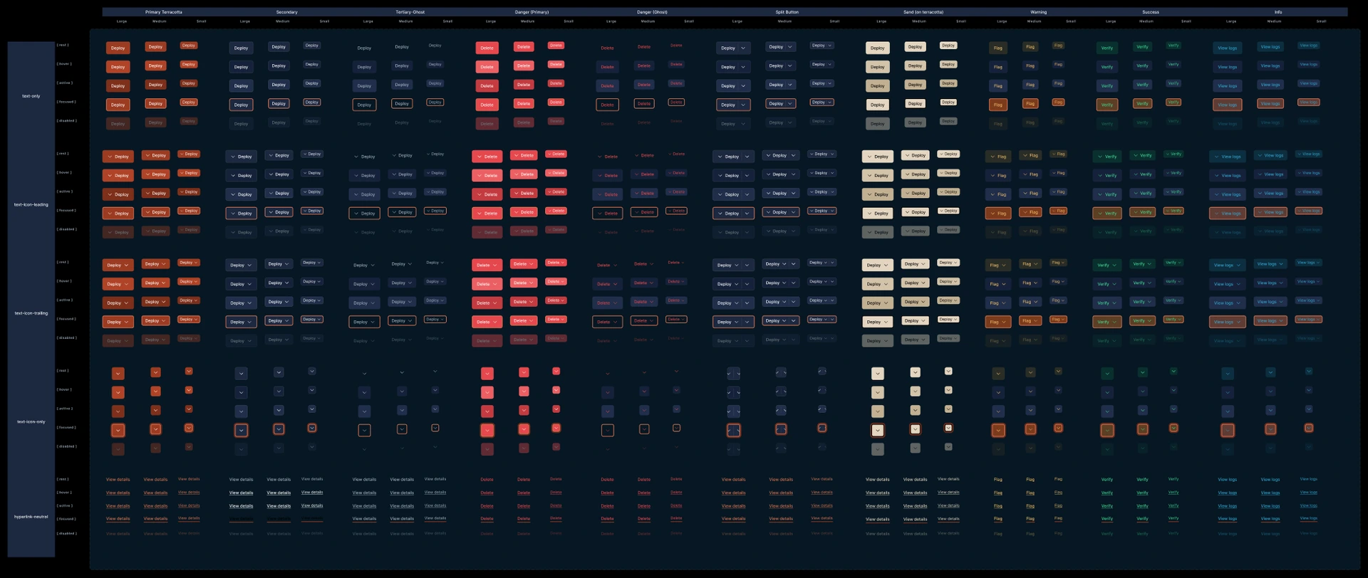
The Button component set: 750 variants organized across a two-tier coordinate grid (10 styles × 3 sizes × 5 layouts × 5 states), where axis labels are driven by measured column widths to prevent alignment drift.
The arithmetic of an absent design system
I did not start in Figma. I started by auditing frontend/src across 322 CSS files and 122,939 lines of CSS.
When engineers have no central system to reference, inconsistency does not announce itself as a crisis. It shows up quietly, as velocity loss, duplicate CSS modules, and broken mental models.
520 unique hardcoded hex colours
8,189 occurrences forming a fragmented palette nobody had agreed to.
2,913 border-radius calls
Spread across 83 distinct values, which made corner curvature an arbitrary matter of developer opinion.
317 media queries
264 of them, 83%, were off-grid across 38 distinct breakpoints. Written by someone eyeballing a browser window at 881px.
84 table implementations
Plus 70 independent CSS modules each defining their own custom table styling.
The silent cascade bug
The worst finding was not a number. It was seven lines of CSS inside frontend/src/app/globals.css. Lines 183 to 219 contained a secondary :root block sitting directly beneath a comment claiming duplicates had been resolved.
/* Commented out duplicate styles keeping only the active styles below */
:root {
  --bg-surface: #1a1a1a;
  --bg-elevated: #242424;
  --primary: #3b82f6; /* silently redefined terracotta to Tailwind blue */
}
Line 210 redefined our terracotta brand, #9C3B22, to generic blue, silently propagating to 189 occurrences across the frontend. Nobody intentionally built a blue design system. The CSS cascade wrote one for us.
This is why every surface and semantic intent in v1.0.0 is strictly bound to tokenized variables enforced at build time, rather than left to a convention people are asked to remember.
Terracotta as a scalpel, and the monotonic surface ladder
Solung Studio provided an opinionated brand deck specifying a 65% navy, 27% sand and white, 8% terracotta palette ratio. But a brand deck specifies a single static slide. An industrial operating system must govern 1,200 virtualized data rows, high-bay glare, and thick work gauntlets.
I transformed the agency’s 8% aesthetic ratio into an enforceable engineering contract: one filled terracotta primary per surface, reserved for dialogs and modals, de-escalating to secondary outlined buttons on dense dashboard grids to prevent dozens of primaries shouting at once.
The surfaces underneath carried the harder constraint. Under high-bay lighting a card has to separate from its canvas without introducing a reflective bright patch, which rules out shadows and leaves lightness as the only instrument. That only works if the steps run in one direction.
Five rungs, each strictly lighter than the one above it. Depth is carried by lightness alone, which is why the system ships no drop shadows.
Every intent ships twice: a solid fill governs containers, a brightened variant governs type. The rule exists because the fills fail as type. Success fill #228573 lands at 4.35:1 on navy and brand fill #9C3B22 at 2.85:1, so both are barred from carrying a label.
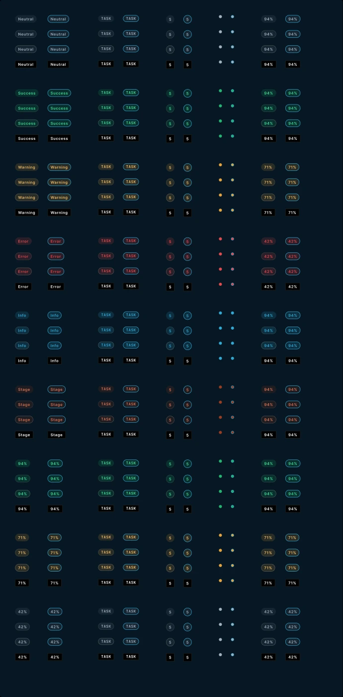
The bright pairs in production: every semantic intent across pill, tag, count and dot forms, each pairing a soft tint container with its brightened type token.
Ergonomic contracts for gloved operators
Welders and fitters wear heavy Kevlar and leather gauntlets. Standard 20px desktop controls cannot be targeted, while loose spacing destroys information density for project managers triaging 40 jobs. Both constraints are real, and neither one yields.
I resolved it through two architectural component contracts.
The 44px invisible hit target. To keep data tables compact without sacrificing glove accessibility, table buttons and inline triggers maintain a visual height of 28px, backed by an invisible pseudo-element that expands the hit target to a non-negotiable 44px boundary. Because the expansion happens on ::after, it never enters layout, so the row height does not move.
Drawn at true scale. The 44px hit area exactly fills the row it sits in, which is what makes glove operation free: density and touch accessibility stop competing once the target stops being the same object as the button.
The merged compound input. The counter-and-commit pattern, logging received parts at the dock, is the highest-velocity control on the floor. The numeric field, denominator, and submit button share one border box with zero gaps, so the group reads as a single instrument rather than three adjacent controls.
Focus is isolated to a 2px terracotta bottom border on the active cell. Illuminating the whole group would light the submit button before the operator has finished entering a count, which is exactly the moment you do not want to suggest that committing is the next step. Form inputs use that bottom border rather than a four-sided box for the same reason: a box around a text field reads as a button, and on a touch screen operators tap it expecting something to happen.

Merged compound number input at close to its rendered size: 0px structural welding with focus isolated to the active entry cell.
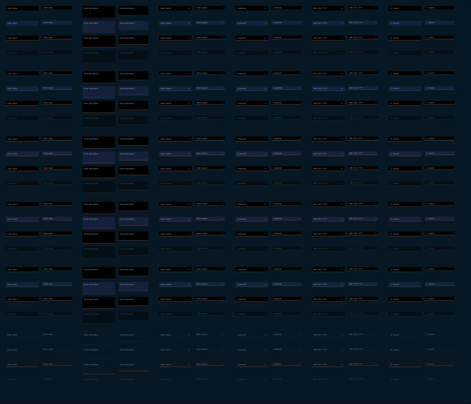
The input set across text, select, multi-select, date and search variants. Reading down each column shows the 2px bottom-border standard carrying rest, hover, focus, error and disabled without ever closing into a four-sided box.
Deterministic avatar geometry. The third contract covers identity. Avatars encode entity type through shape rather than colour: a circle is a person, a hexagon is an automated parsing agent, a square is an external vendor. Shape survives glare, greasy screens, and colour vision deficiency, none of which colour does.
The fill colour is hashed from the immutable user ID, never from rank or role permissions. Deriving it from permissions would have leaked the org chart into every comment thread on the floor.
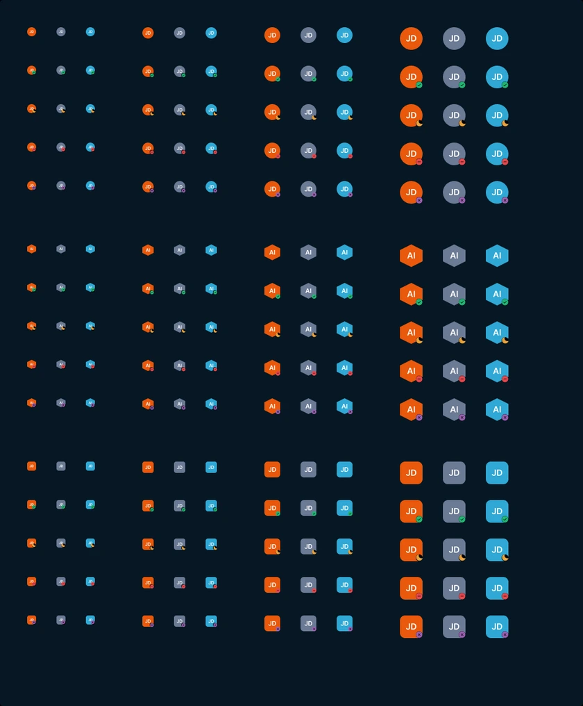
Deterministic avatar architecture: geometry encodes entity type (circle for a person, hexagon for an AI agent, square for a vendor), while colour is hashed from the immutable user ID so it can never encode rank.
Governance that runs without me
A design system that relies on verbal policing collapses the moment the author leaves the room. So the rules had to live somewhere that keeps working when I am not in the review: in Linear, and in the release pipeline.
The component intake pipeline. Additions are drafted on a Figma sandbox canvas and filed against the JEEVY-1197 request template in the Design System: Component Intake project. Two fields do the real work. “Target consuming view” means a component with no screen waiting for it is not approved. “Why existing components do not work” is the field that prevents duplicates, and if an engineer answers “I could not find one,” that is a discoverability bug in the Assets panel rather than a missing component.
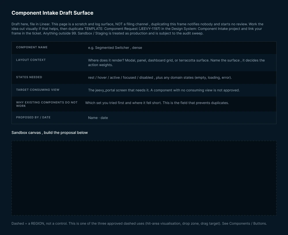
The intake surface. The page is a scratch and log surface, not a filing channel: duplicating the frame notifies nobody and starts no review, and anything left outside the sandbox is treated as production and swept.
Automated 14-day audit sweeps. A continuous script scans active production views every 14 days to catch component detachment or unmapped hex codes before they reach a shop terminal. The sweep is what makes the sandbox rule enforceable rather than aspirational: staging surfaces are audited exactly like production, so nothing accumulates in a grey zone.
Contrast as a gate, not a review note. Every new layout variant introduced to cards or inputs is evaluated automatically against pure black and the dark navy surfaces, enforcing the 4.5:1 WCAG 2.1 AA text floor. Working from my DHS Trusted Tester certification, I also locked font sizes to whole-integer size and line-height pairs, so no label lands on a fractional pixel and turns to anti-aliasing blur on the low-DPI terminals mounted in the bays.
| Release tier | Cadence | Breaking | Approval authority | Governance rationale |
|---|---|---|---|---|
| Major (1.0.0) | Semi-annual, two scheduled windows a year | Yes | Visual Design Lead, with a migration timeline | Spaced deliberately to minimise breaking-change friction across engineering teams. Breaking changes land only inside these windows, never ad hoc. |
| Minor (0.1.0) | Monthly | No | Design Lead sign-off | Net-new standalone components and backward-compatible token expansions accumulate through the month and ship together, so consuming teams integrate once per cycle. |
| Patch (0.0.1) | Bi-weekly, continuous | No | Any core contributor | Critical fixes ride the 14-day audit sweep: whatever the sweep flags is corrected and released inside the same cycle. |
The tiers exist so that breaking changes are predictable rather than polite. Consuming teams can plan against a semi-annual window instead of negotiating each change, and patches ride the sweep that found them.
Retrospective: the 7 measurable faults we eliminated
During pilot deployment on the Tasking Planner, across 31 files, we encountered visual debt and interaction friction that no amount of Figma review had caught, because most of it only appears once real data is in the grid. We audited the root causes and locked them into system invariants.
1. The glowing card mistake
#1C2840 → #122033Resting cards at #1C2840 (L* 16.18) were brighter than the hover token at L* 14.92, so cards dimmed under the cursor instead of lifting. Recalibrated bg-elevated to #122033 and bg-hover to #17263C, restoring monotonic lightness and letting cards lean on a 1px sand stroke.
2. Button sizing in tables
40px → 28px Small40px buttons bloated every table row and broke vertical rhythm. Table actions are locked to the 28px Small variant, backed by an invisible 44px hit-target boundary.
3. Context and layout thrashing
Inline tray → 340px popoverClicking cross-project dependencies pushed table rows down and broke column alignment. External items moved into an anchored 340px popover, which also removed an invalid nested button from the DOM.
4. Geometry drift
0px / 4px / 9999pxCompeting 0px, 4px and 6px values replaced with a three-tier contract: 0px for structural shells, 4px for interactive controls, 9999px for passive status pills.
5. The monospace temptation
Inter / Aspekta stackMonospace had spread decoratively across plain words. Human text unified on the Inter and Aspekta stack, isolating monospace to numeric steppers, where it prevents digit jitter, and to keyboard shortcuts.
6. Toolbar crowding
8px space-2 grid2px gaps jammed 1px hairlines together into muddy bars. Toolbar spacing standardised to an 8px grid with icon buttons locked to an exact 32 by 32px square.
7. Functional motion
360° SVG spin · aria-busySilent re-fetching made operators double-click. A 360 degree mechanical SVG spin now binds to aria-busy="true" and respects prefers-reduced-motion.
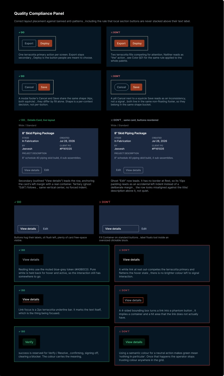
The production Quality Compliance Panel: each invariant paired with the specific anti-pattern it exists to prevent, so a reviewer can settle an argument by pointing rather than by explaining.
Verified Outcomes
- 10,507 bound paints. 100% token coverage across 41 documented pages, eliminating all 520 unmapped hex values.
- Zero contrast failures. 104 text labels promoted to bright-pair tokens, achieving full WCAG 2.1 AA compliance verified under DHS Trusted Tester standards.
- 1,688 variants shipped. Consolidated into 10 component sets published to the live team library with zero drift.
- Single-theme monotonicity. Fixing the root cascade bug restored brand terracotta across every web, kiosk, and mobile surface at once.
Systems reflection: measure before restyling
The core lesson of building v1.0.0 was recognising that visual flaws are almost always symptoms of broken underlying data models or inverted token ladders.
The glowing card is the clearest case. It looked wrong, and every instinct said to pick a nicer blue. The actual fault was that the resting surface sat 1.26 points of lightness above its own hover state, so no colour choice at rest could have fixed it. Once the ladder was monotonic, the card stopped needing an opinion.
A button does not look wrong because of subjective taste. It looks wrong because its contrast step is non-monotonic or its DOM tree is invalid. When a design system is treated as an engineering contract, consistency takes care of itself. The same instinct runs through the blueprint and CAD file manager ↗, where the constraint was a mental model rather than a token.