Faculty Workload
Management Research.
We interviewed 8 faculty members and ran 5 participatory design sessions to understand how university professors manage competing responsibilities across teaching, research, and service, and what a better support system could look like.
Role
UX Researcher (Interviewer & Note-taker)
Team
Pradeep, Hitarthi, Mansi, Saumya, Hansika
Timeline
Spring 2025
Institution
University of Maryland, iSchool
00 / CONTEXT
Understanding the problem space.
Faculty members at research universities juggle an extraordinary range of responsibilities, from delivering lectures and mentoring students, to publishing research, sitting on committees, advising on policy, and preparing for promotion reviews. Despite the complexity, most rely on a patchwork of disconnected tools: personal calendars, sticky notes, spreadsheets, email threads, and mental bookkeeping.
Our team set out to answer a single research question: How do university faculty members manage and prioritize their workload across teaching, research, and service? We wanted to understand not just what tools they use, but how they think about their time, what falls through the cracks, and what kind of system would actually make their lives easier.
This wasn't an academic exercise in the abstract. We conducted real interviews with real faculty, observed their workspaces, reviewed their calendars, and co-designed solutions with them. The findings directly informed a set of design recommendations for a tool we call Workflow.
“We wanted to understand the invisible systems faculty have built for themselves.”
Research team, initial project brief
PROCESS
Our research design process.
We followed a structured, iterative research process that moved from understanding the problem space to co-creating solutions with faculty. Each phase built directly on the outputs of the previous phase, ensuring that our final design recommendations were grounded in real data and validated by the people who would use the tool.
Research Planning & Study Design
Defined research questions, established participant recruitment criteria, designed the interview guide around 4 thematic areas, and obtained IRB approval. We aligned with stakeholders on project scope and expected deliverables.
Contextual Interviews
Conducted semi-structured interviews with 8 faculty members across teaching, research, and director-level roles. Each session lasted 30–60 minutes, with rotating moderator and note-taker roles to reduce observer bias.
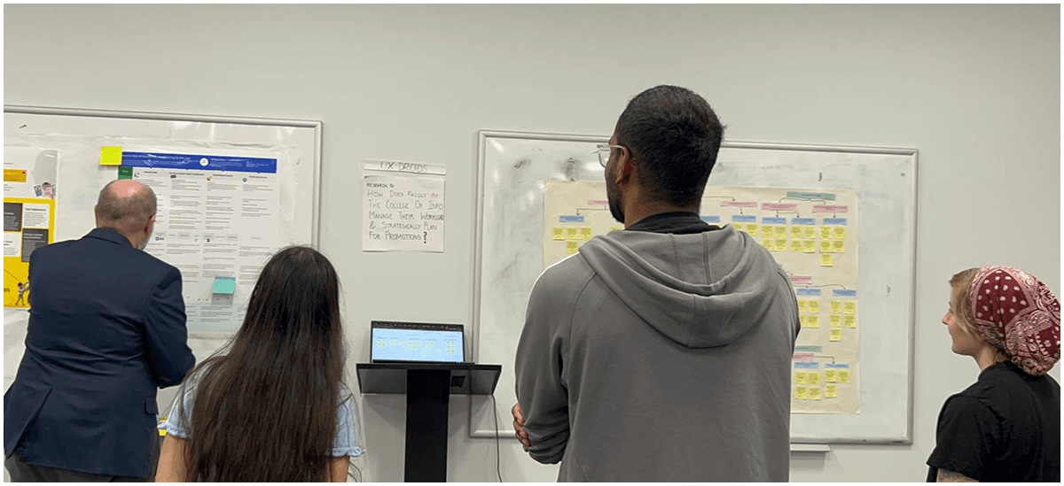
Interpretation & Affinity Mapping
Ran team interpretation sessions after each interview to extract atomic insights. Organized 120+ data points into an affinity diagram on Miro, revealing 6 distinct thematic clusters around workload, tools, productivity, and career growth.
Journey Maps & Identity Models
Created a detailed journey map tracing a typical faculty week with emotional highs and lows. Built an identity model mapping the roles, relationships, and institutional dynamics that shape faculty work.
Participatory Design Sessions
Facilitated co-design workshops with 5 faculty using FigJam. Activity 1: participants mapped their typical week and annotated pain points. Activity 2: participants assembled their ideal dashboard from modular interface components.
IA, Concepts & Design Recommendations
Synthesized all findings into a proposed information architecture. Created low-fidelity sketches from participant feedback, then developed mid-fidelity prototypes (Faculty Navigator 360) with actionable design recommendations.
01 / METHODOLOGY
How we structured the research.
We used a two-phase mixed-methods approach. Phase 1 consisted of semi-structured contextual interviews with 8 faculty members. Phase 2 involved participatory design sessions with 5 of those same participants. The two phases were designed to build on each other, interviews surfaced pain points and behaviors, while participatory sessions explored potential solutions.
Our interview guide was structured around four thematic areas, each designed to progressively deepen our understanding of faculty work. We started broad, asking about daily tasks and routines, then narrowed into specific tool usage, personal goals, and the emotionally charged topic of promotion documentation.
Design Thinking Framework, Double Diamond
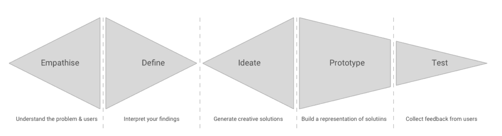
Our research followed the Double Diamond framework, diverging to explore the problem space through contextual interviews, converging through affinity mapping, then diverging again in participatory design before converging on validated design recommendations.
Topic 1
Daily Tasks & Responsibilities
We explored how faculty structure their days, how tasks are assigned, whether they delegate, and what their calendar and workspace organization looks like. This gave us a baseline understanding of workload distribution.
Topic 2
Tools Used for Workload Management
We asked what tools faculty rely on, from Google Calendar to handwritten lists, what works, what doesn't, and what features they wish existed. We observed tool demonstrations and noted workarounds and duplications.
Topic 3
Personal & Professional Goals
We discussed long-term career aspirations, how personal commitments impact academic work, how success is measured during evaluations, and whether faculty feel their contributions are adequately recognized.
Topic 4
Documentation & Promotion Preparation
We explored the promotion review process: what documentation is expected, how it's collected throughout the year, and whether faculty have experienced gaps or frustrations when assembling their dossiers.
A note on iteration: Our original interview guide was significantly longer. After an internal review, we identified overlapping questions, reorganized around thematic clusters, and cut the guide down to a more focused structure. This reduced cognitive fatigue for participants and improved data quality. Similarly, our participatory design plan was initially loosely defined, we refined it after our first two interviews revealed that participants responded well to reflective prompts and visual organization.
02 / PARTICIPANTS
Who we spoke with.
We conducted contextual interviews with 8 faculty members across a range of academic roles, teaching-focused, research-active, leadership, and advisory positions. We used study IDs (A01–H01) to maintain confidentiality. Each team member conducted at least one interview, and roles rotated between interviewer and note-taker to ensure consistency.
| ID | Role Description | Interviewer | Note-taker |
|---|---|---|---|
| A01 | Teaching + Advisor Faculty | Hitarthi | Mansi |
| B01 | Teaching + Director Faculty | Saumya | Pradeep |
| C01 | Teaching Faculty (Remote) | Mansi | Saumya |
| D01 | Director Level Faculty | Saumya | Hitarthi |
| F01 | Research + Teaching Faculty | Pradeep | Hitarthi |
| G01 | Teaching Faculty | Hansika | Saumya |
| H01 | Teaching Faculty | Hansika | Pradeep |
Five of these participants (C01, D01, F01, G01, H01) also took part in participatory design sessions, where they engaged in weekly timeline mapping and custom dashboard design.
03 / DATA COLLECTION
How we captured and organized the data.
Each interview lasted 30–60 minutes and was recorded with participant consent. One team member led the conversation while the other took detailed notes. After each session, we ran interpretation sessions where the full team reviewed recordings to extract atomic insights, individual observations, quotes, and behavioral patterns, which we wrote onto digital affinity notes.
We collected verbatim transcripts, observational notes, and digital artifacts from participatory sessions (sticky notes, sketches, and user-generated diagrams on FigJam). In total, we generated over 120 discrete data points.
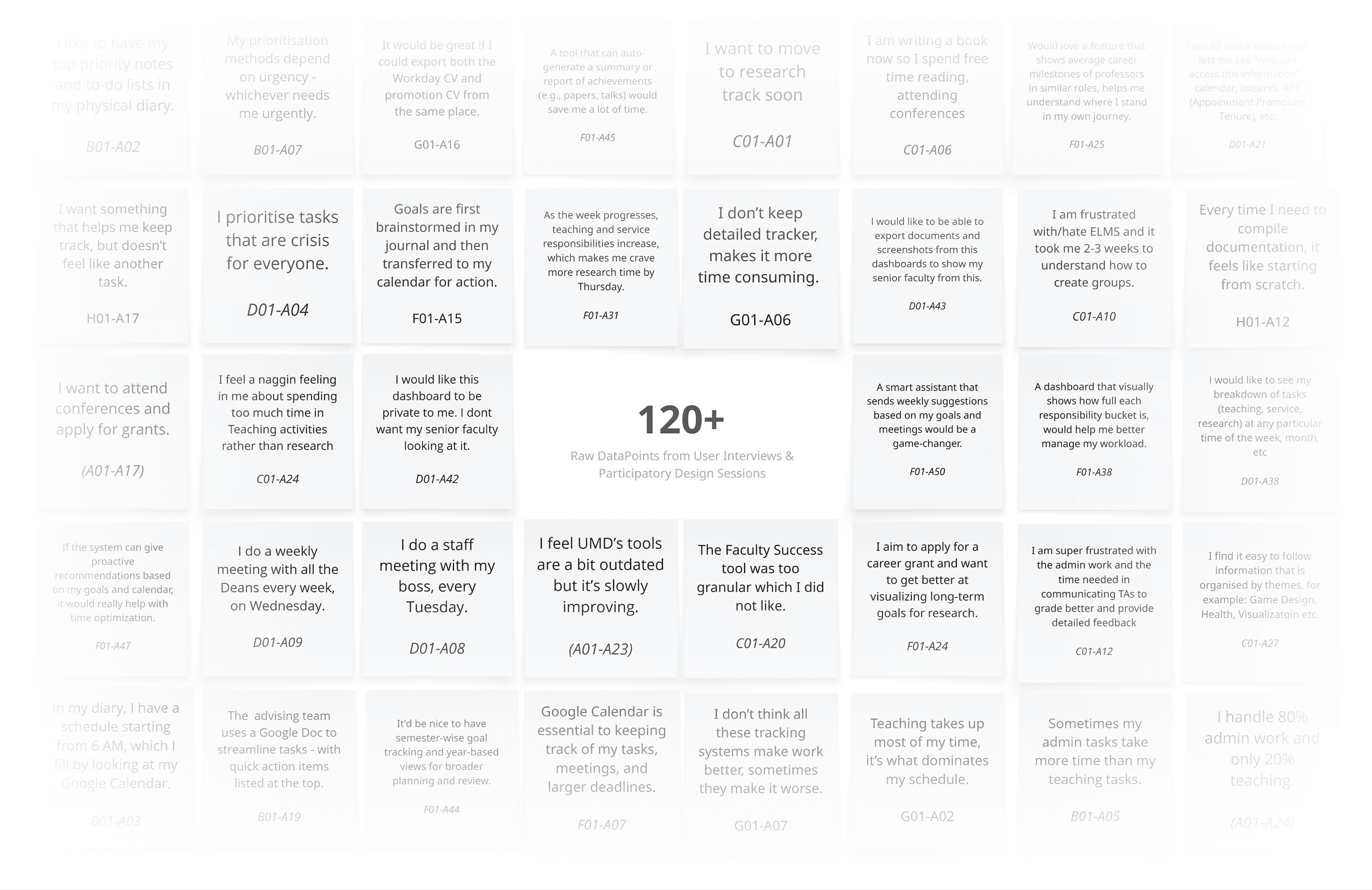
Data points overview across interviews and participatory design sessions.
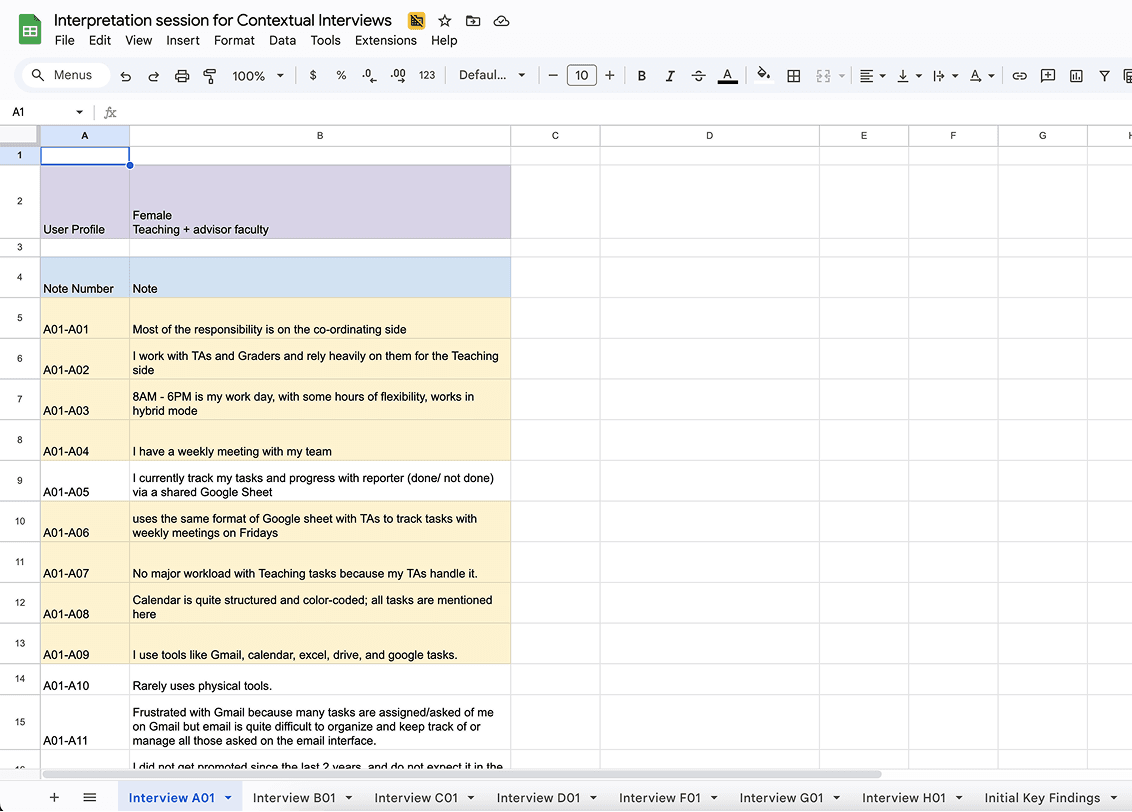
Creating affinity notes during interpretation sessions.
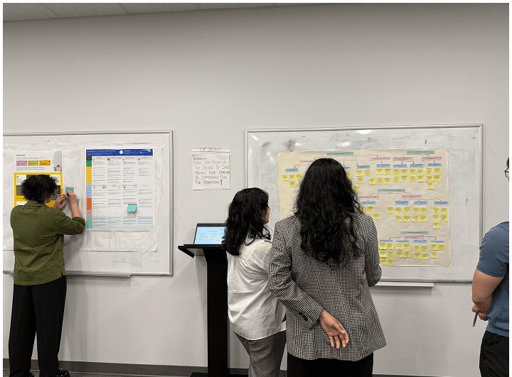
“The wall walk helped us see patterns we couldn't see on screen.”
During the affinity diagram wall walk activity
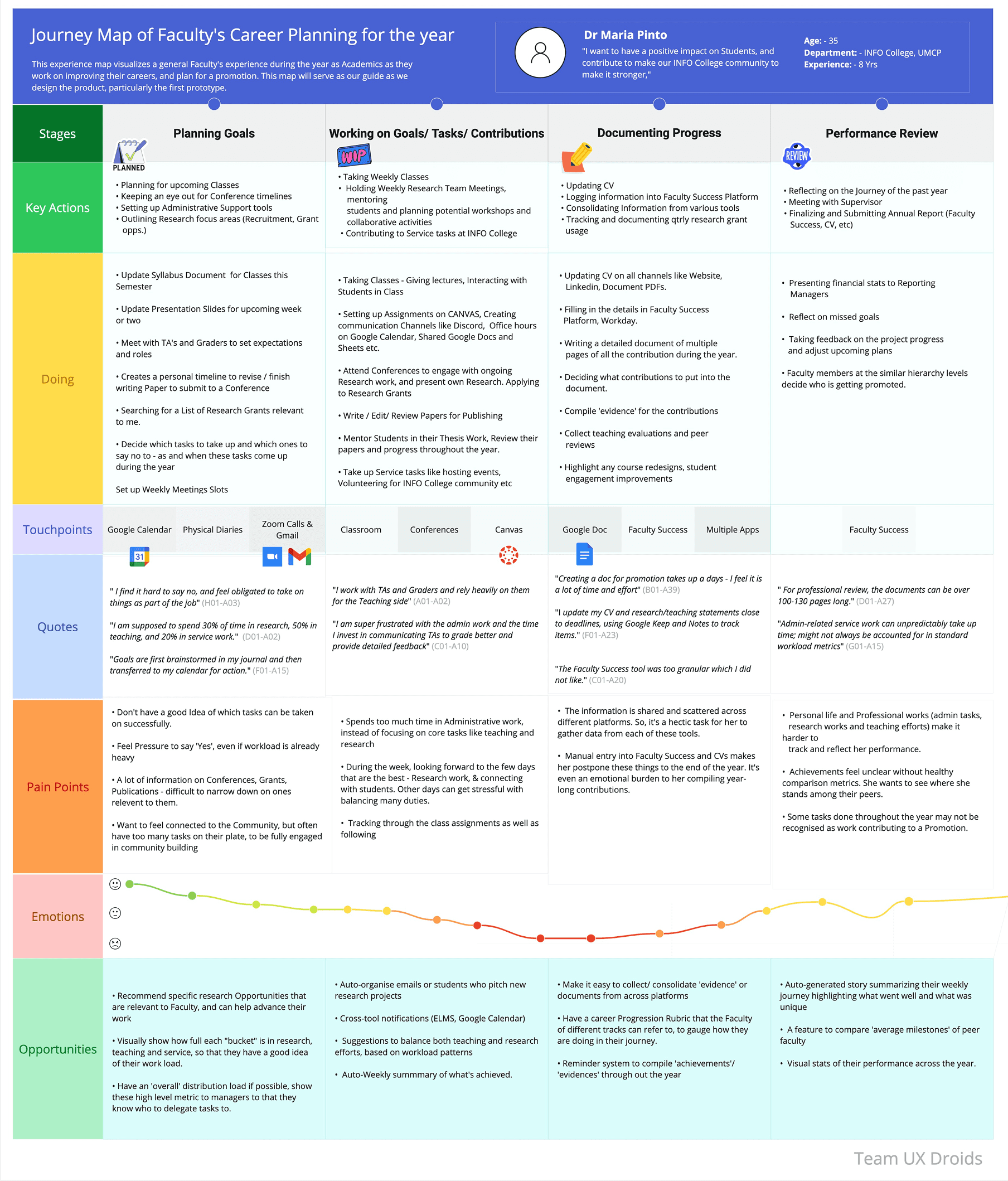
04 / FINDINGS
What the data told us.
After organizing our 120+ affinity notes, six distinct thematic clusters emerged. Each cluster represents a core dimension of the faculty workload management experience, from how they handle digital tools to how they think about career growth and performance reviews.
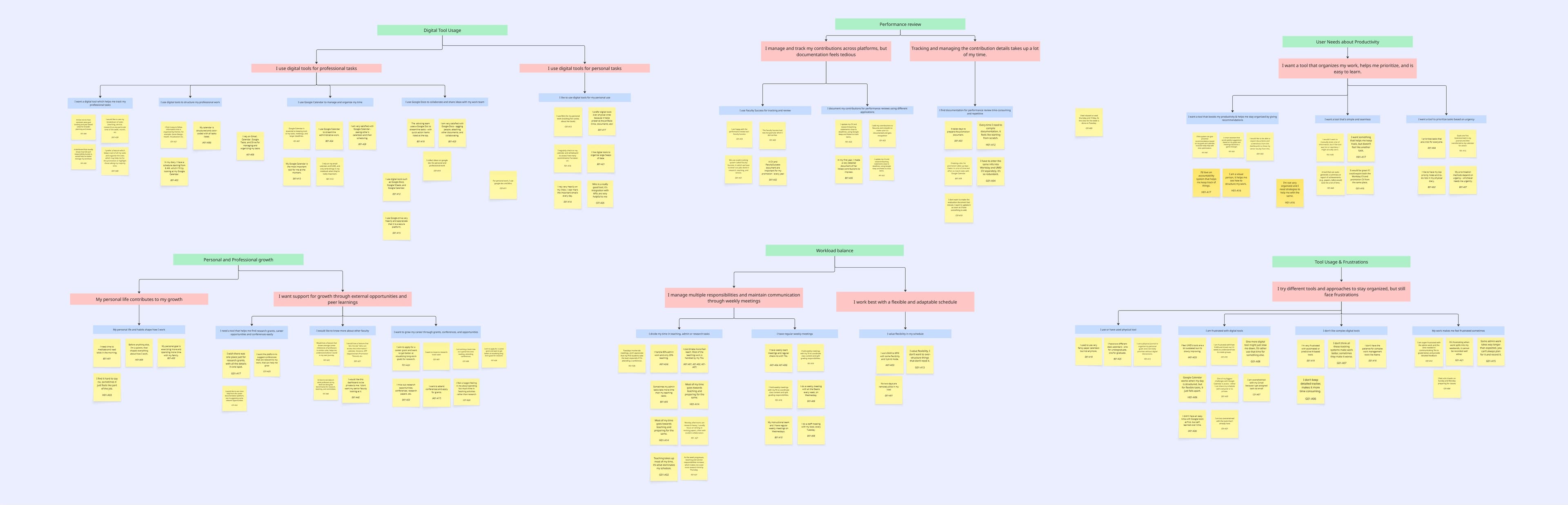
Complete affinity diagram, 120+ data points organized into 6 thematic clusters on Miro.
View on Miro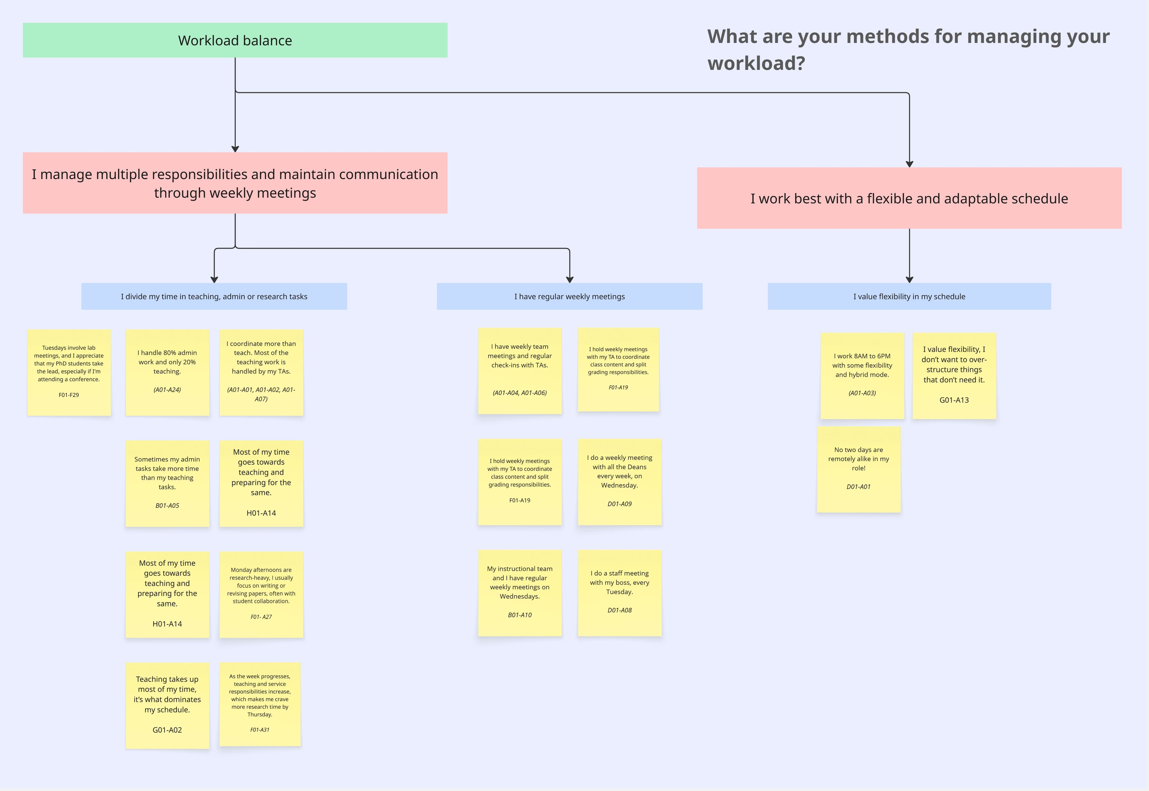
Workload Distribution
Faculty struggle with the sheer volume and variety of tasks. Service work is often invisible but consumes significant time.
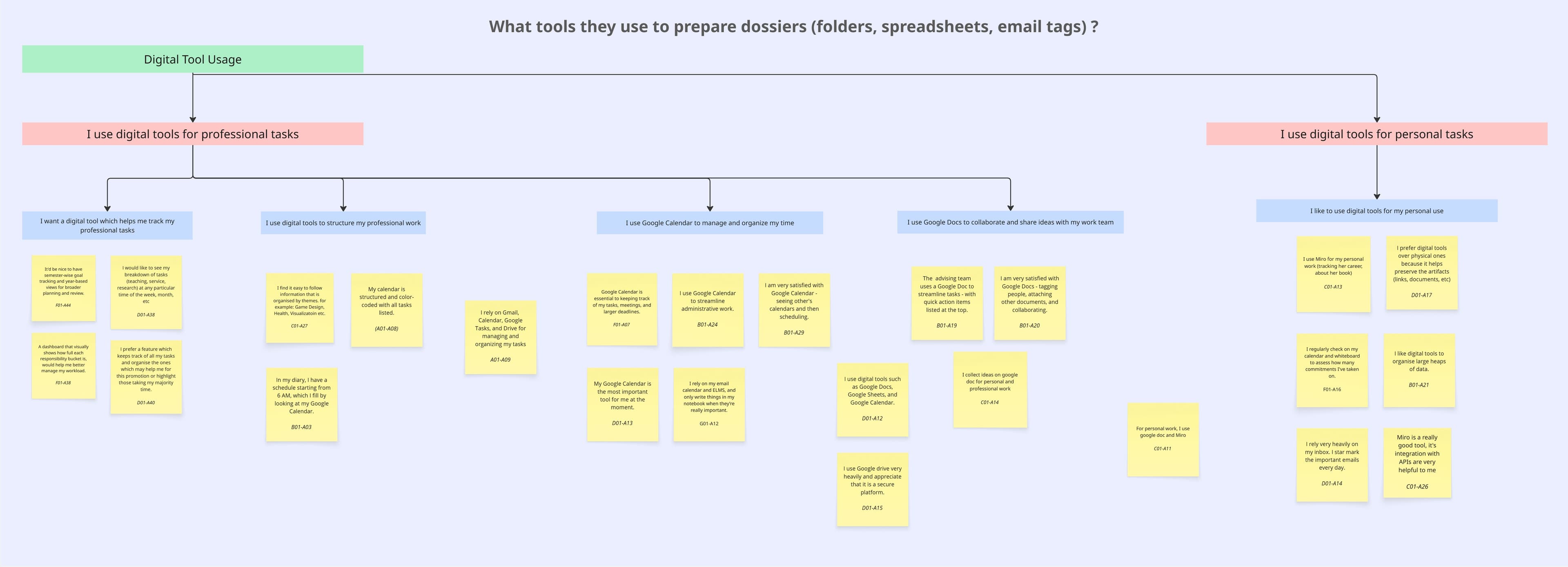
Digital Tool Usage
Faculty use 4–7 disconnected tools daily. No single system provides the overview they need.
Productivity Patterns
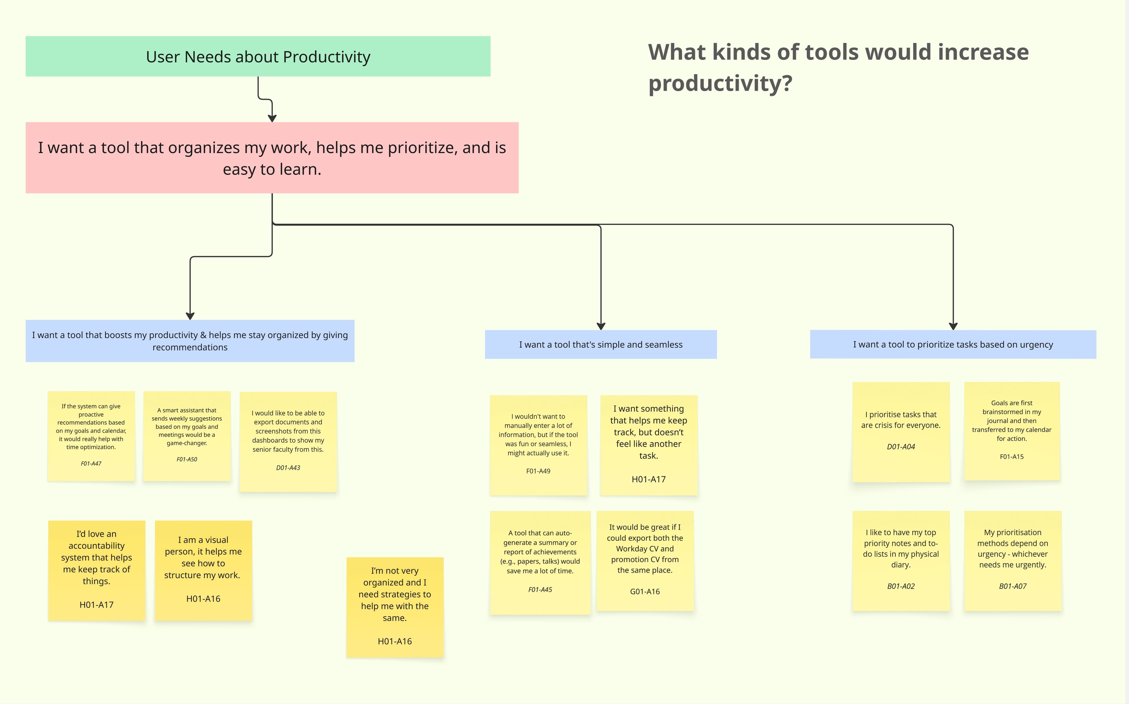
Deep work happens in early mornings or late nights. Meetings fragment the day and reduce output.
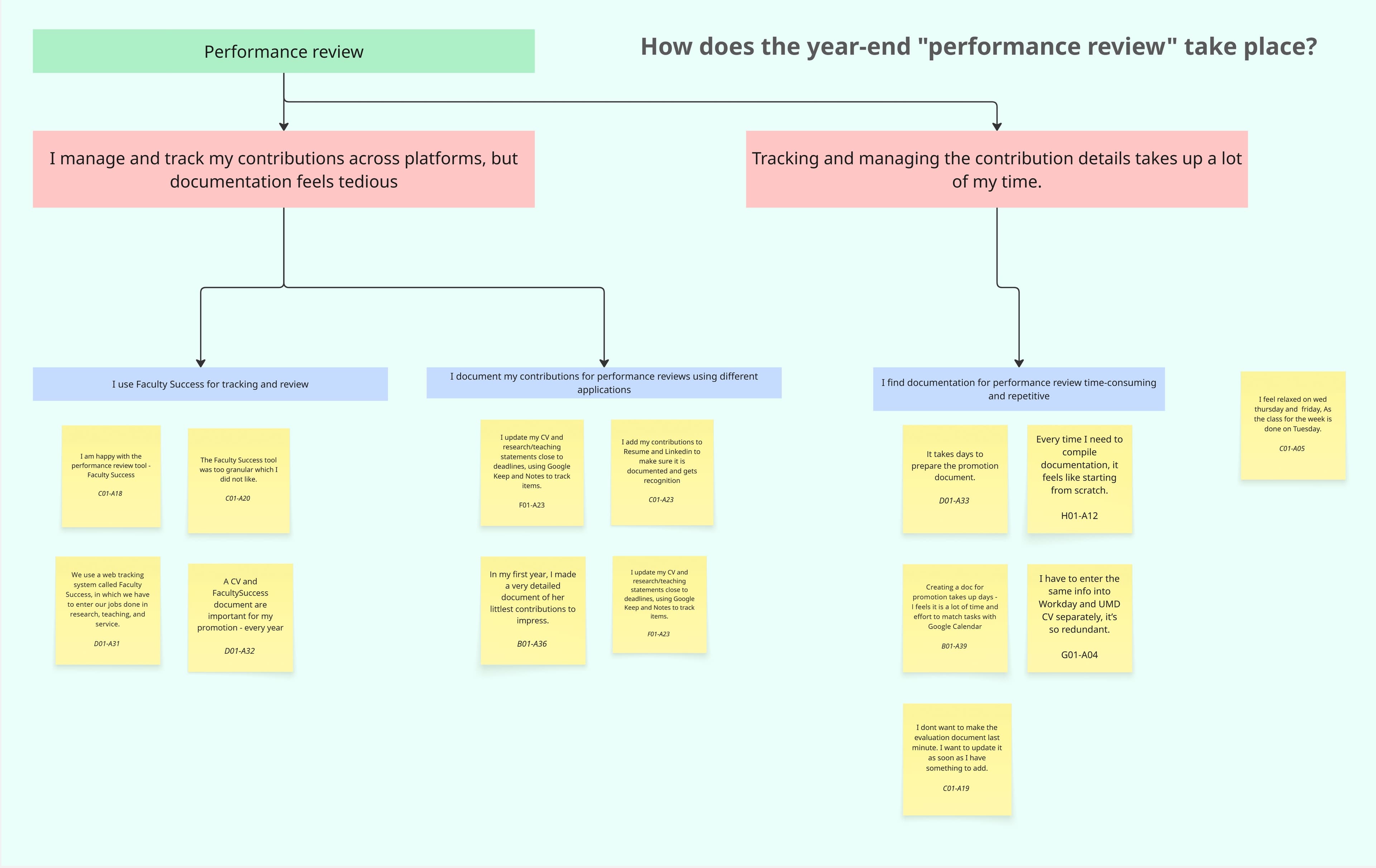
Performance Reviews
Faculty find it stressful to assemble promotion evidence retroactively. They wish they tracked it continuously.
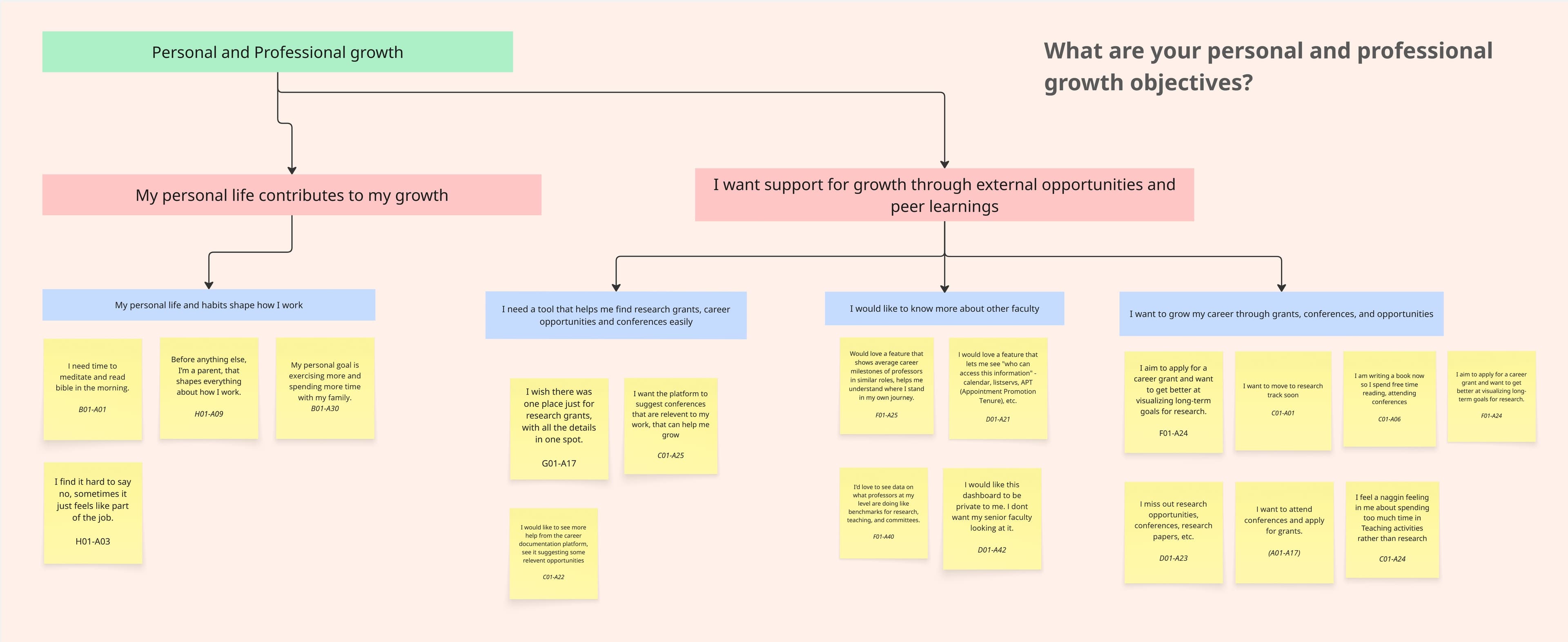
Growth Objectives
Long-term goals often take a back seat to urgent daily tasks. Faculty want a system that keeps goals visible.
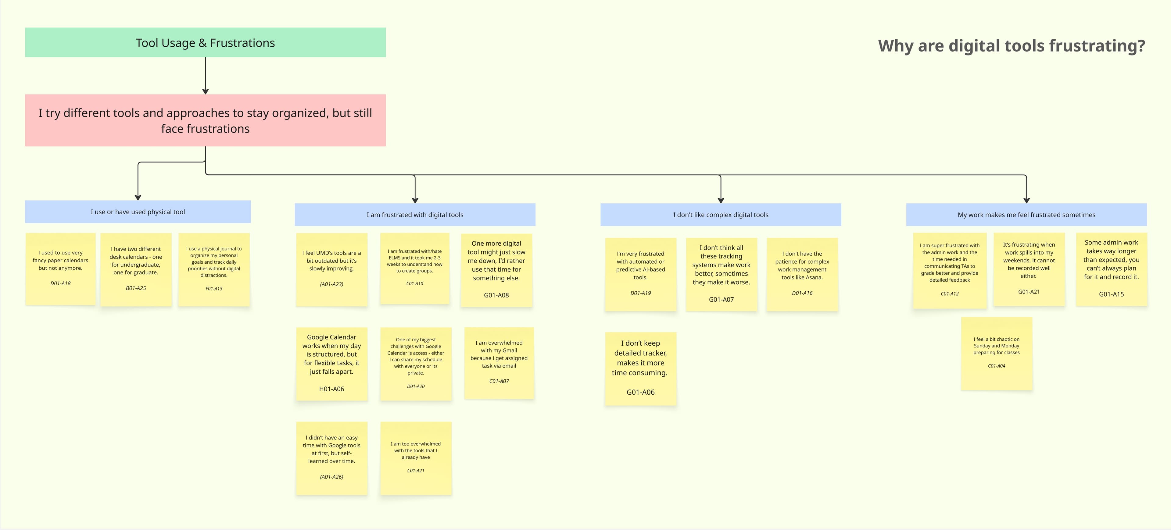
Tool Frustrations
Workarounds and manual duplication are common. Faculty want integration, not another standalone tool.
05 / SYNTHESIS MODELS
Making sense of faculty workflows.
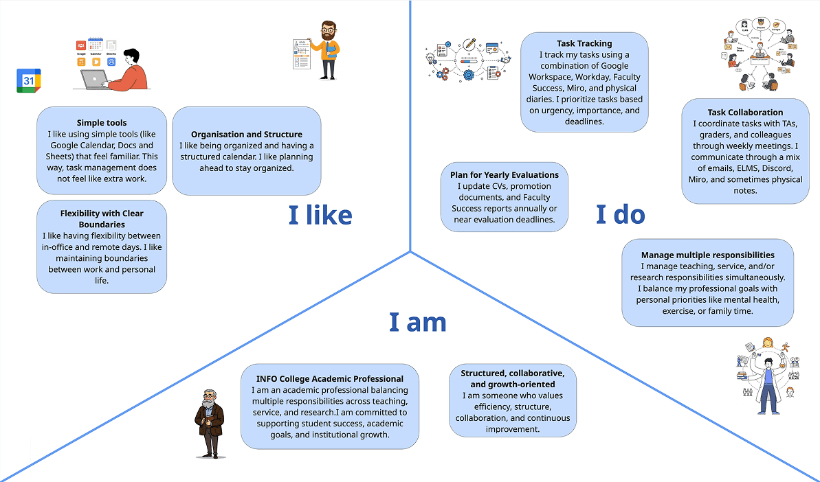
Beyond the affinity diagram, we created two synthesis models to visualize our findings from different perspectives. The journey map traces a typical faculty member's week, highlighting emotional highs and lows. The identity model captures the roles, responsibilities, and social relationships that shape how faculty think about their work.
Journey Map, A Typical Faculty Week
Identity Model, Faculty Roles & Relationships
06 / PARTICIPATORY DESIGN
Co-creating solutions with faculty.
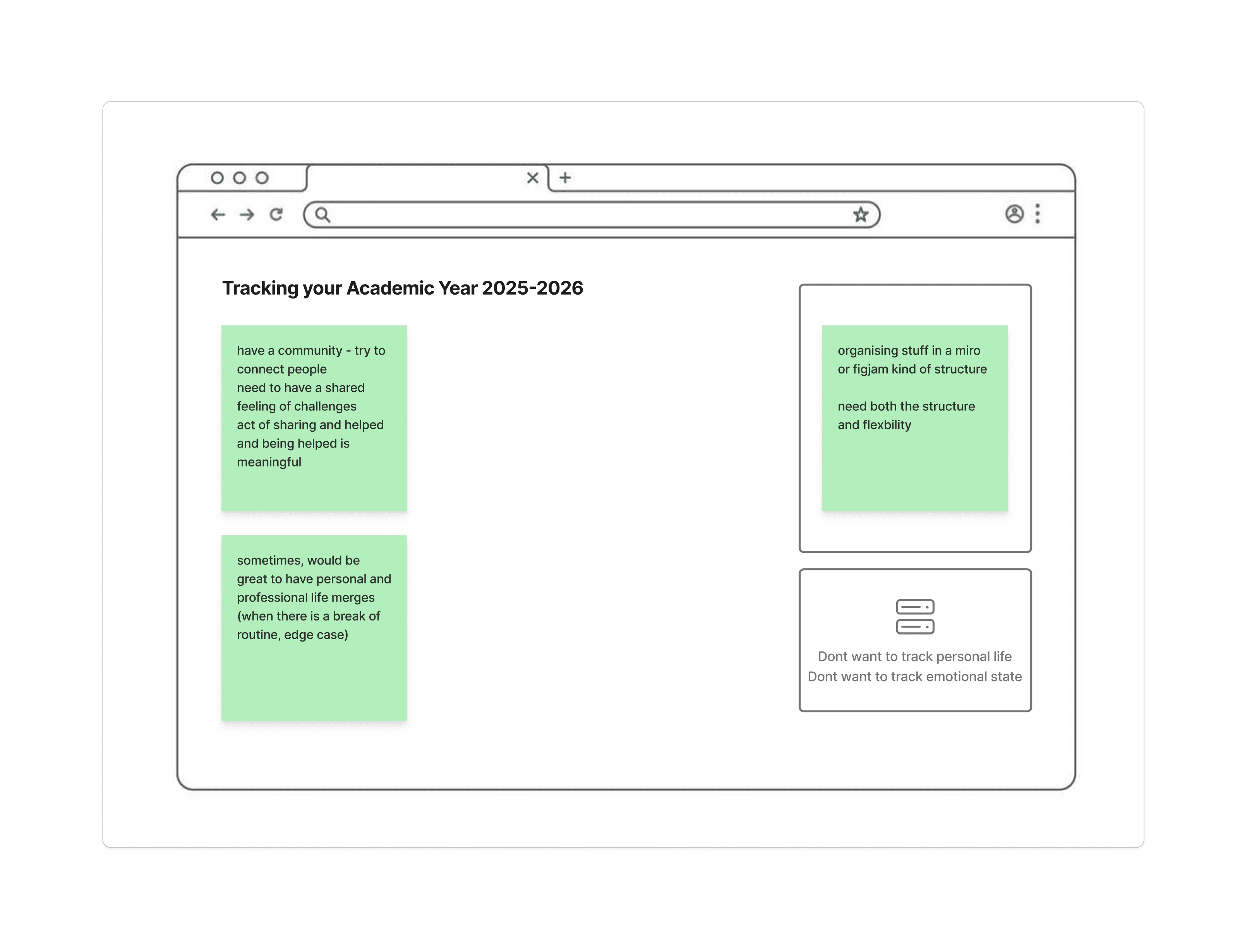
After completing the contextual interviews, we facilitated participatory design sessions with 5 faculty members. These sessions were designed to move beyond understanding problems, we wanted faculty to actively shape solutions.
Each session included two structured activities conducted through FigJam. We walked participants through the tools, adapted the pace to their comfort level, and kept prompts intentionally open-ended to encourage diverse input.
Activity 1
Weekly Timeline Mapping
Participants mapped their actual week (Mon–Sun) on a blank timeline, noting activities, tools used, emotional states, and moments of chaos or organization. They marked where they felt supported and where tools failed them.
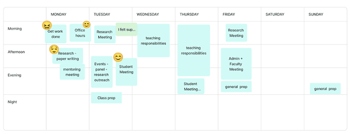
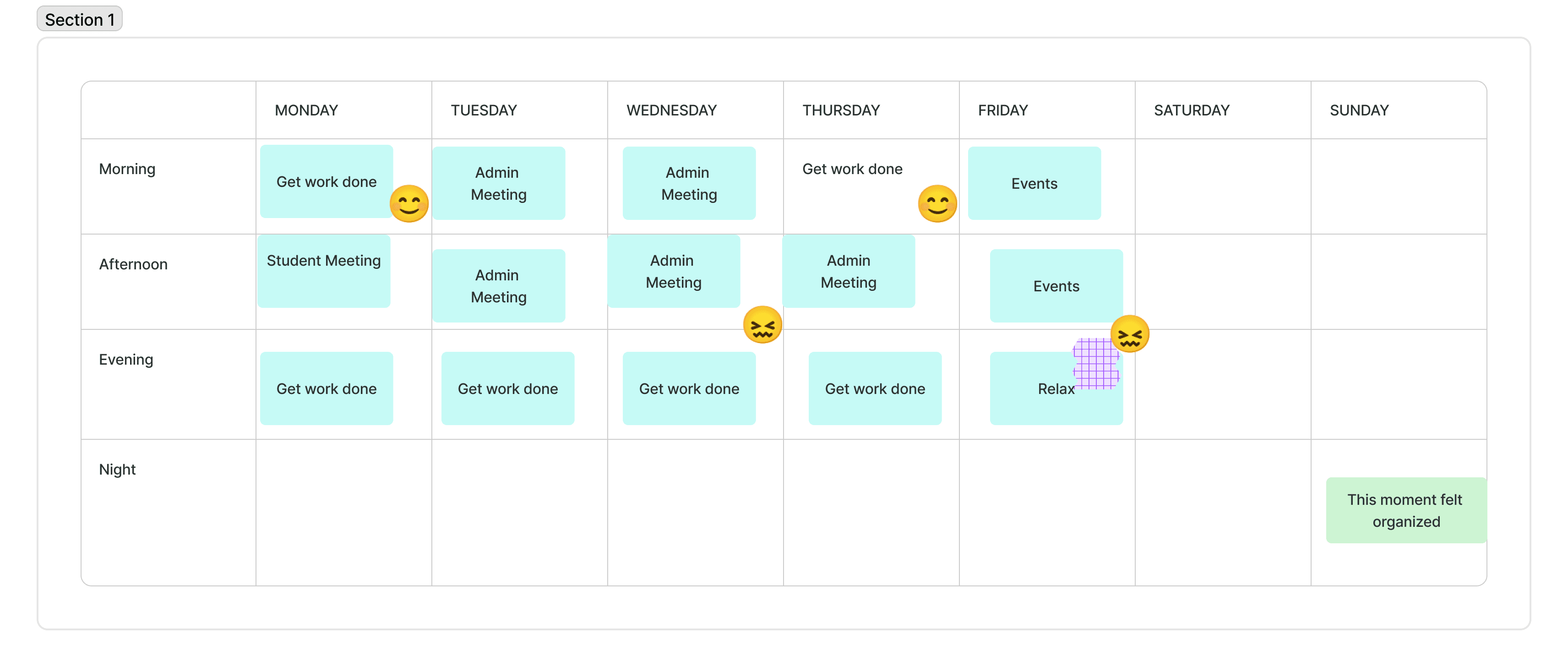
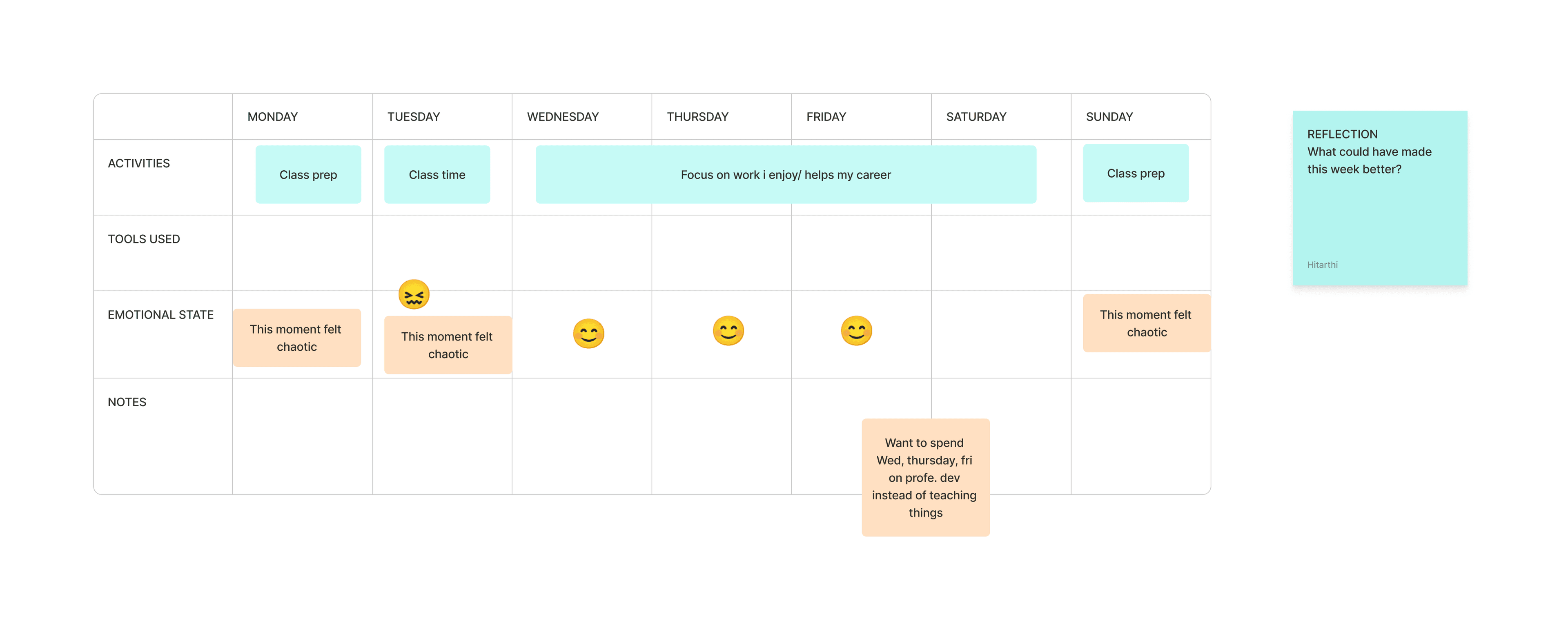
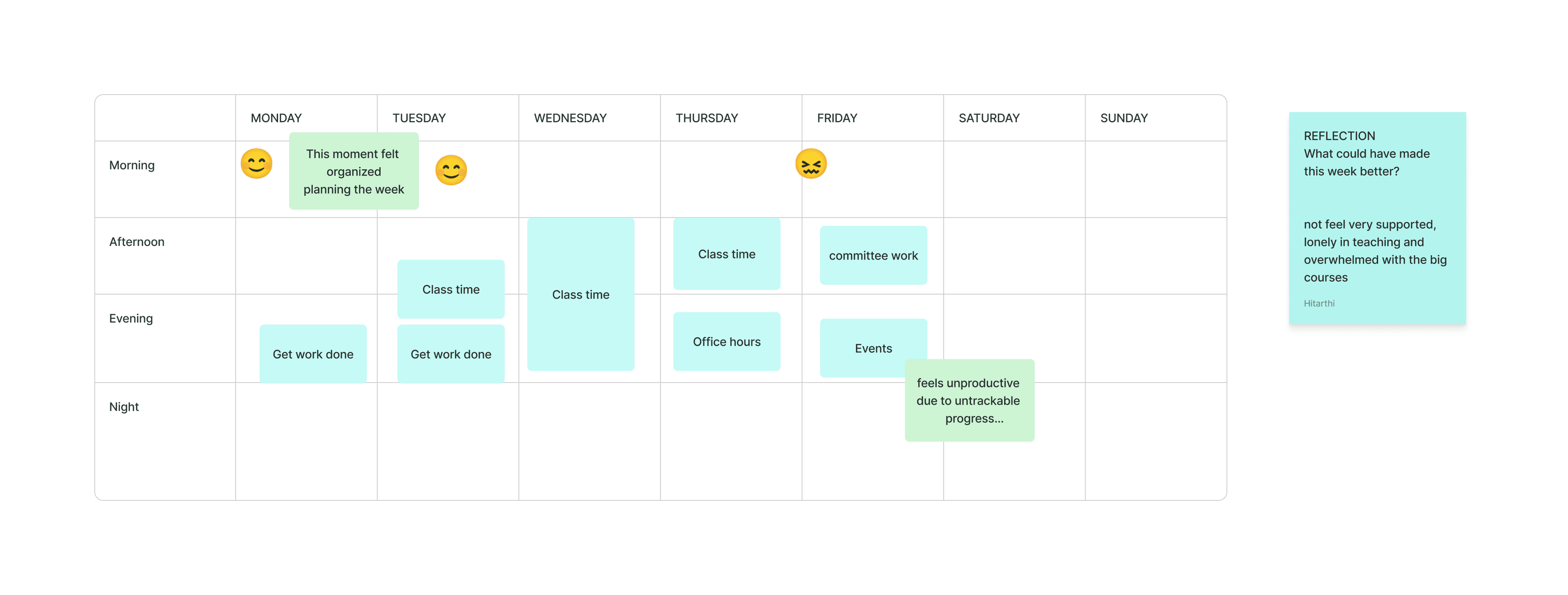
Hover to reveal all responses · 4 responses
Activity 2
Design Your Dashboard
Faculty were given interface cards (task list, calendar, notes, recognition wall, goal tracker, promotion timeline) and asked to assemble or sketch their ideal dashboard. This revealed what features matter most and how they want to track success.
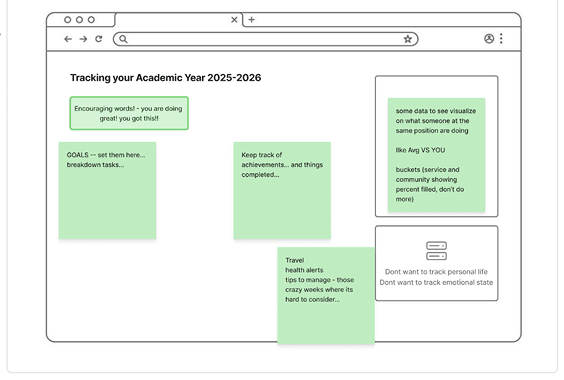
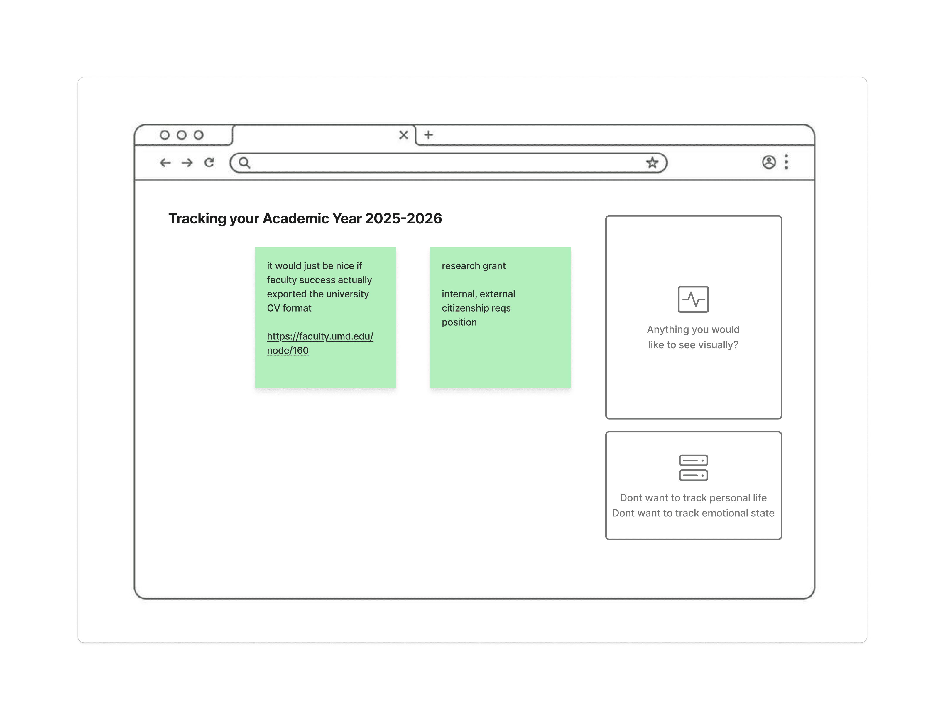
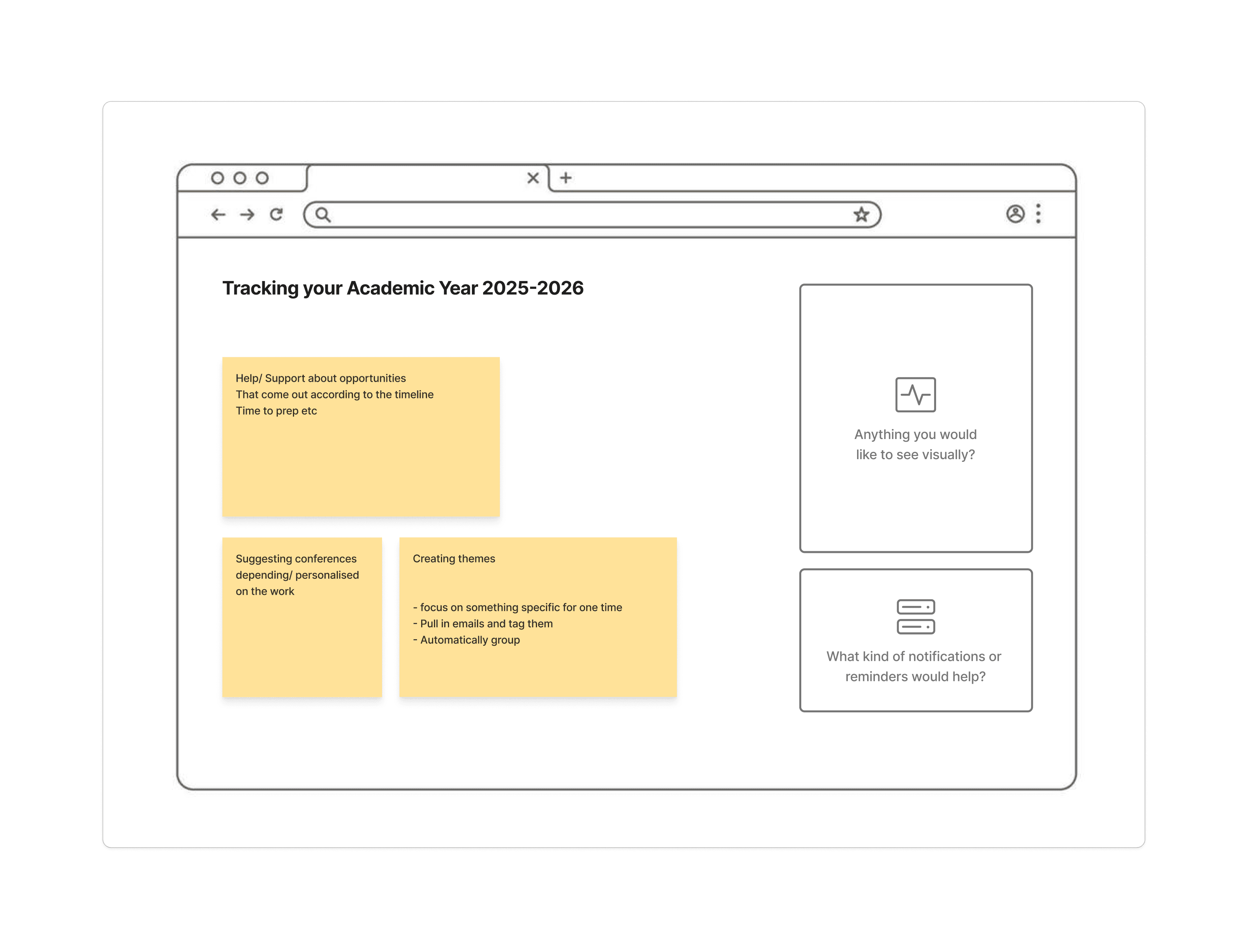
Hover to reveal all responses · 4 responses
All Participatory Design Responses
07 / INFORMATION ARCHITECTURE
Structuring the Workflow tool.
Based on our synthesis, affinity clusters, journey maps, and participatory design outputs, we developed an information architecture for the Workflow platform. The IA reflects the mental models faculty actually use, not an administratively imposed structure.
Proposed IA, Workflow Faculty Dashboard
Dashboard Home
- ·Today's Focus card
- ·Quick-add activity log
- ·Weekly calendar heatmap
- ·Active tasks by category
- ·Upcoming deadlines
Activity Diary
- ·Daily log with category tags
- ·Voice-to-text entry
- ·Auto-categorization (Teaching/Research/Service)
- ·Mood & energy check-in
- ·Linked document attachments
Promotion Tracker
- ·Evidence upload & organization
- ·Timeline progress (Submitted → Review → Decision)
- ·Category-based evidence filing
- ·Gap analysis alerts
- ·Exportable dossier builder
Goals & Milestones
- ·Long-term goal setting
- ·Quarterly milestone tracking
- ·Progress visualization
- ·Goal-task alignment view
- ·Reflection prompts
AI Insights
- ·Workload balance analysis
- ·Burnout risk indicators
- ·Suggested time blocks
- ·Pattern recognition
- ·Peer benchmarking (anonymized)
Weekly Reflection
- ·Guided end-of-week review
- ·Accomplishment highlights
- ·Next-week priorities
- ·Emotional check-in (emoji scale)
- ·Exportable summary
08 / DESIGN CONCEPTS
From paper sketches to mid-fidelity prototypes.
Based on the color-tagged feedback from participatory sessions and our affinity clusters, we ideated on five distinct feature concepts. These started as paper sketches informed by real participant input, then evolved into mid-fidelity mockups.
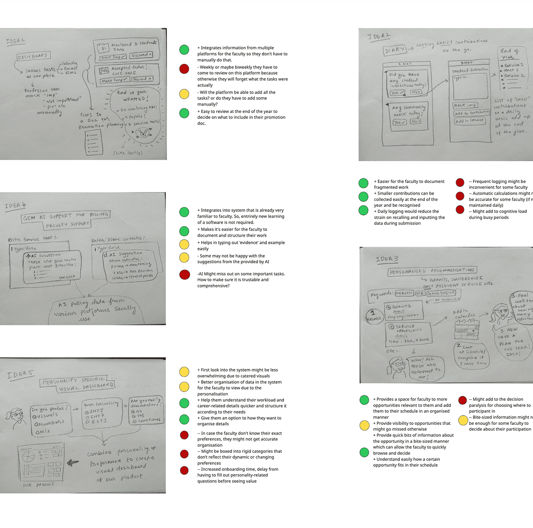
Color-tagged feedback from participatory sessions informing our initial sketches.
Low-Fidelity Concept Explorations
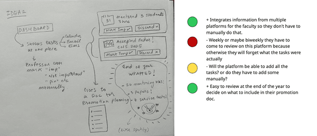
Dashboard Overview
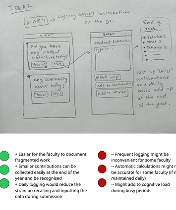
Activity Diary
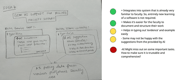
Gen AI Support
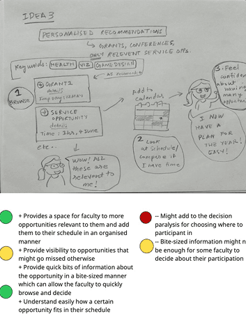
Personalized Recommendations
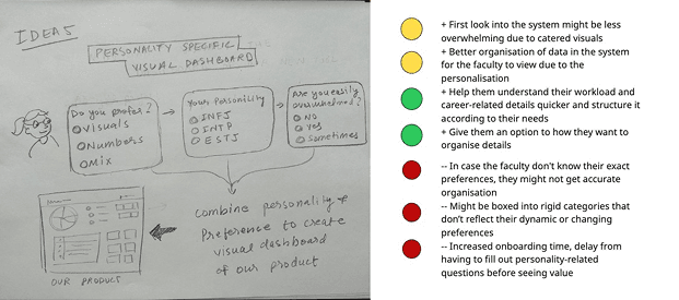
Personality-Specific Dashboard
Mid-Fidelity Prototypes, Faculty Navigator 360
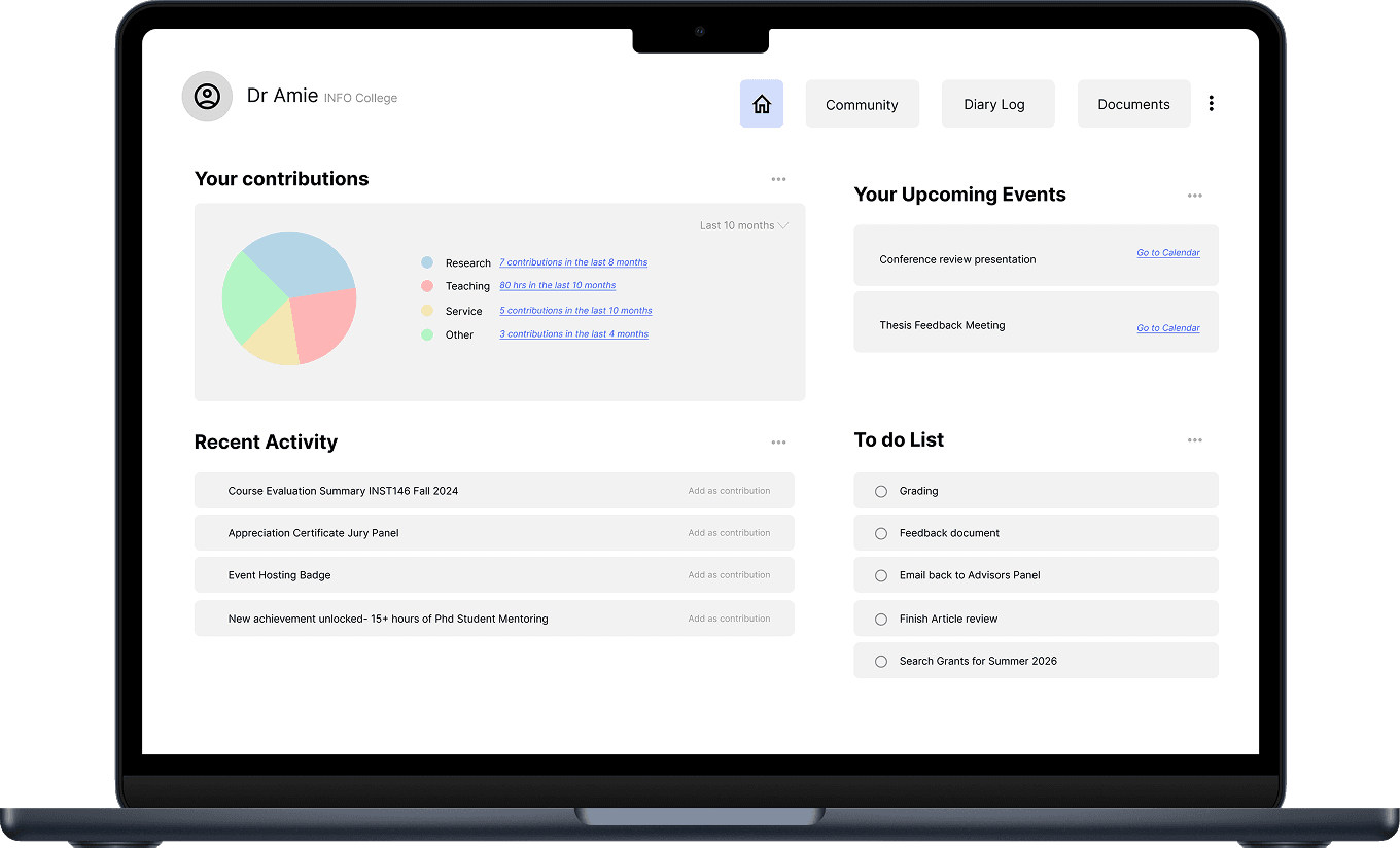
Homepage Dashboard
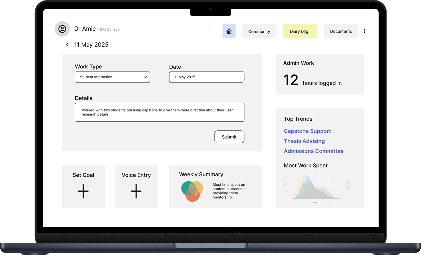
Diary Log Page
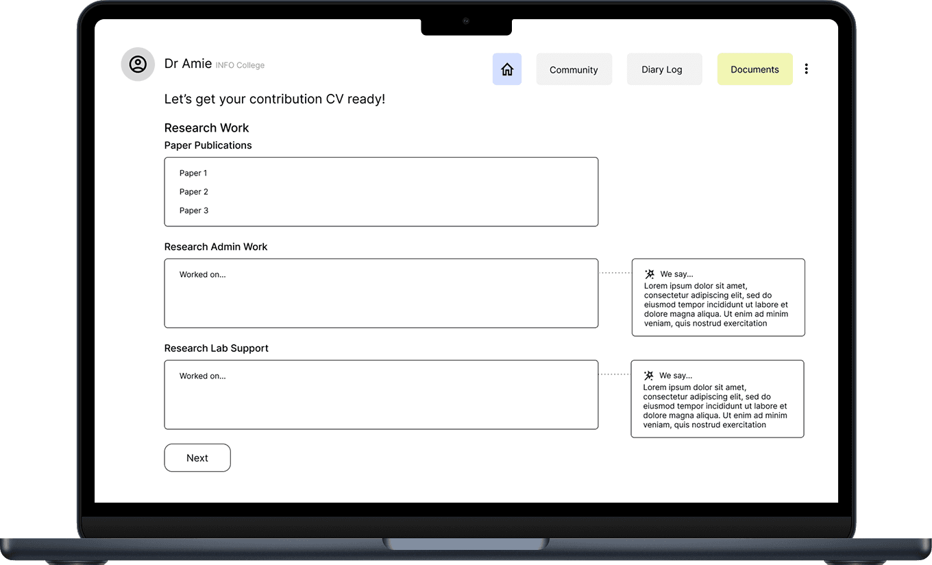
Documents Page
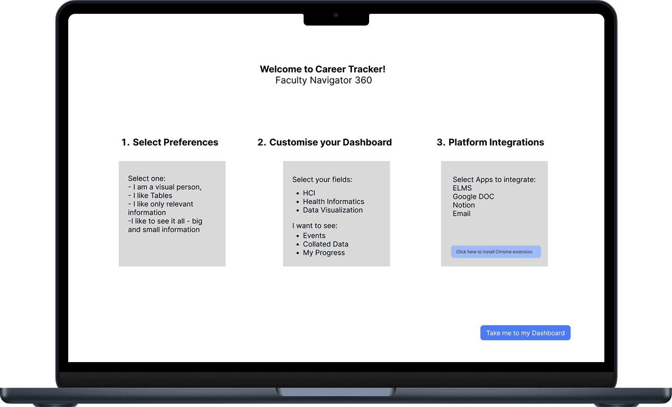
Onboarding Plan
“Every sticky note is a real person's frustration with an invisible system.”
During the affinity mapping wall walk
09 / HIGH-FIDELITY DESIGN
Bringing Workflow to life.
High-fidelity mockups coming soon.
The final high-fidelity designs are currently being developed based on the research findings and design concepts above. This section will be updated with the polished UI for the Workflow platform.
10 / REFLECTIONS
What this research taught us.
Reflection
Faculty labor is invisible by design
Service work, mentoring, and committee participation consume significant time but are systematically undervalued in promotion reviews. Any support tool must make this labor visible.
Reflection
Tools fail because they fragment attention
Faculty don't need another app, they need integration. The most common complaint was toggling between 5–7 disconnected tools just to understand their own week.
Reflection
Co-design produces better outcomes
The participatory design sessions generated insights that interviews alone could not. When you put the design tools in the hands of the people who will use them, the priorities become self-evident.
University of Maryland - College of Information Studies