Researching the
Express Lanes Experience.
A mixed-methods UX research study, conducted in-house at Transurban Virginia, to identify critical usability barriers in toll payment, wayfinding, and account management for 127 Express Lane users.
Research Methods
Mixed-methods survey · Semi-structured interviews · Think-aloud usability testing · Affinity mapping · SUS · UEQ
Research Areas
Toll payment flows · HOV/Express Lane wayfinding · Transponder onboarding · Account management · Penalty communication
Tools
Miro · Notion · System Usability Scale (SUS) · User Experience Questionnaire (UEQ)
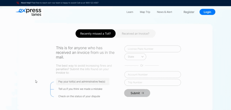
Payment flow prototype, one of the key interaction sequences evaluated during usability testing sessions.
A government-backed usability challenge.
The EZ Pass Transurban Usabilathon was a competitive UX research challenge in which select teams were invited in-house to Transurban's Virginia offices to evaluate the Express Lanes user experience end-to-end, from pre-trip wayfinding through post-trip account reconciliation.
Unlike a traditional academic project, this was a real-world stakeholder engagement: our research findings were presented directly to the Transurban product and policy team, with the expectation that identified friction points would inform roadmap decisions.
The scope was deliberately broad, covering physical wayfinding, digital account management, transponder onboarding, and penalty communication, reflecting the full user lifecycle rather than a single touchpoint.

EZ Pass Maryland · Transurban, the two systems whose integration created the core user experience friction we investigated.
Mixed-methods from the ground up.
We designed a convergent mixed-methods protocol, combining a quantitative survey phase for breadth with a qualitative interview and usability-testing phase for depth. The two datasets were triangulated during synthesis to distinguish widespread systemic issues from edge-case friction.
The survey instrument was distributed to 127 Express Lane users across the Northern Virginia corridor, capturing frequency of use, self-reported pain points, transponder familiarity, and satisfaction proxies. Survey responses were used to prioritize interview topics and identify participant segments for the qualitative phase.
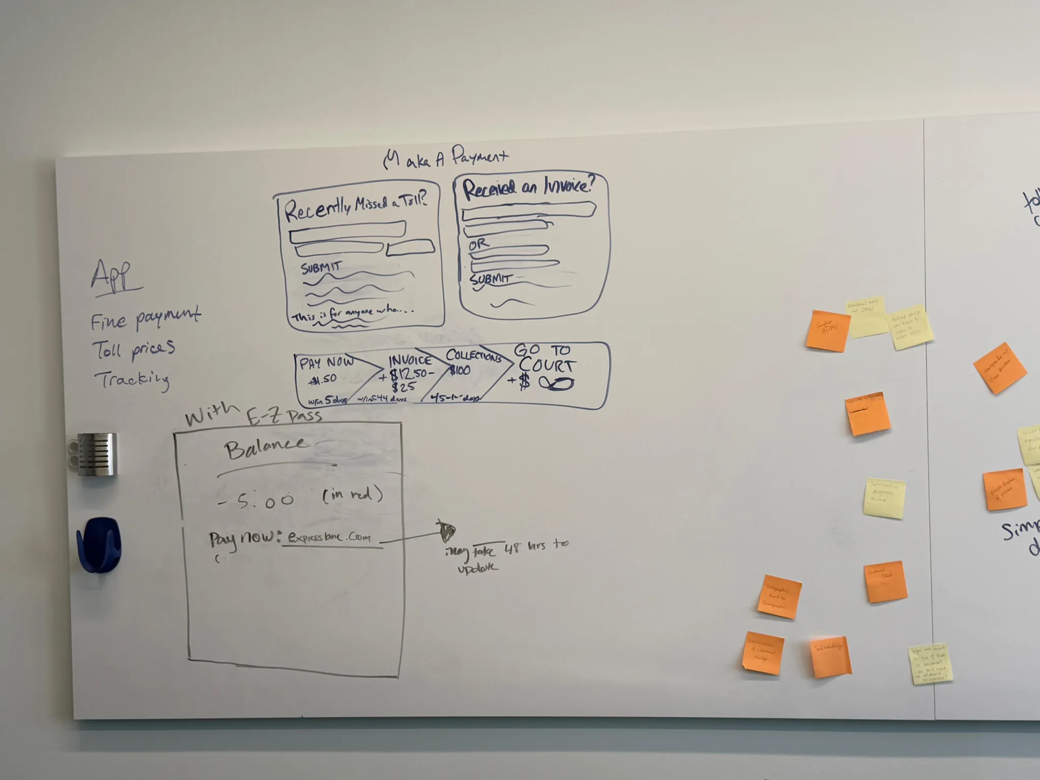
Research plan whiteboard, scoped and structured in-house at the Transurban Virginia office on day one.
Phase 1, Generative survey
127-participant quantitative sweep
Structured questionnaire distributed to active Express Lane users. Captured usage frequency, self-reported pain points, and satisfaction ratings to identify the highest-prevalence friction themes before committing interview time.
Phase 2, Qualitative interviews
8 semi-structured in-depth sessions
One-on-one interviews with Express Lane users representing a cross-section of usage patterns, commuters, occasional users, and first-time adopters. Each session followed a flexible topic guide allowing emergent themes to surface organically.
Phase 3, Usability evaluation
Think-aloud protocol + task analysis
Moderated usability testing using a think-aloud protocol. Participants were asked to complete representative tasks, adding funds, locating transaction history, understanding a penalty notice, while narrating their reasoning aloud.
From raw data to actionable insight.
Interview transcripts and usability session notes were synthesized using affinity mapping on Miro, grouping atomic observations into first-order themes, then clustering themes into higher-order problem domains. This bottom-up synthesis process ensured findings were grounded in participant language rather than pre-existing hypotheses.
The affinity map revealed four dominant problem domains that cut across multiple user segments and research phases, confirming their systemic nature rather than representing isolated incidents.
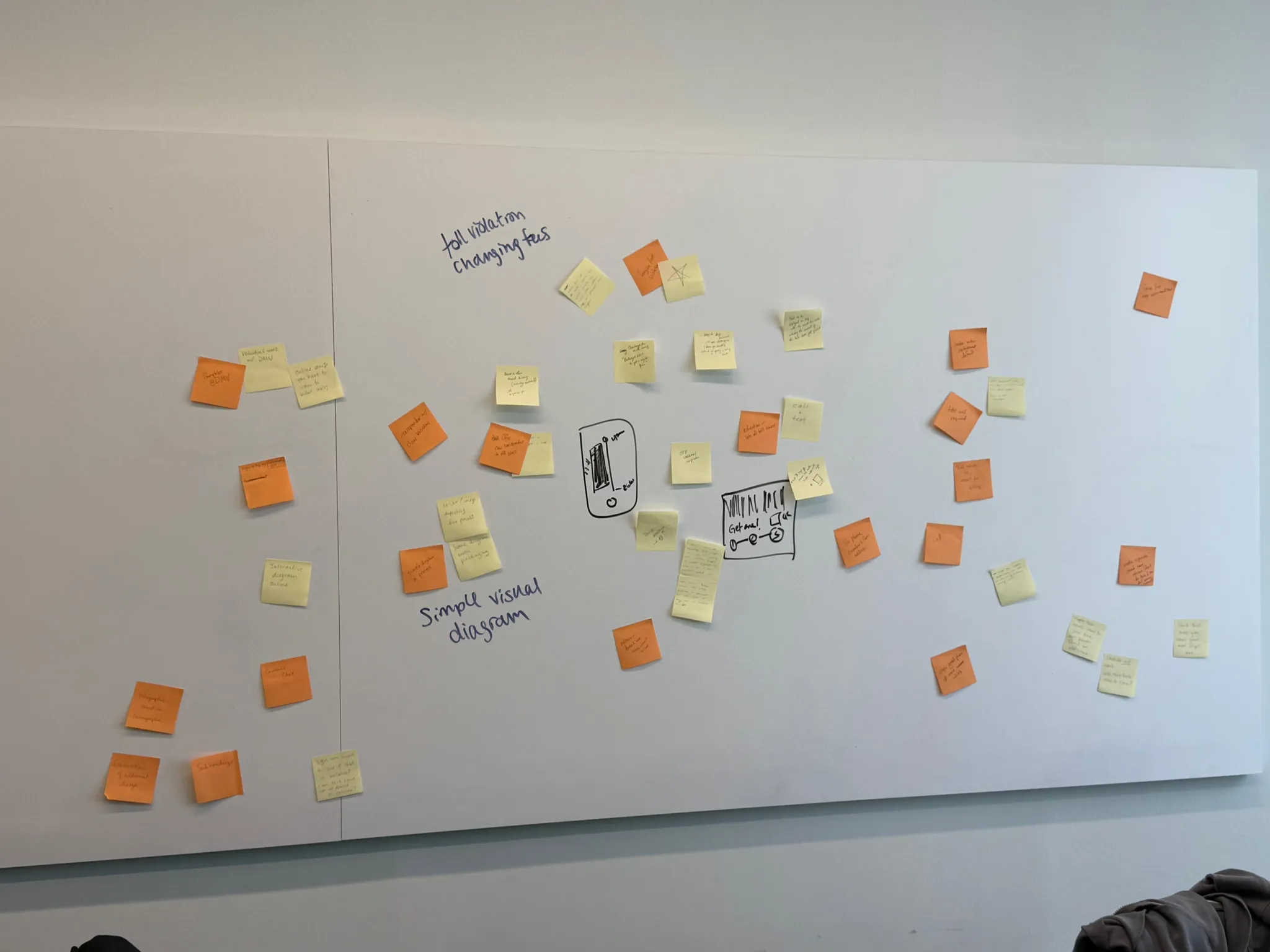
Affinity map, synthesizing 8 interview transcripts and 127 survey responses into dominant usability themes.
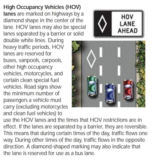
Finding 01, Wayfinding
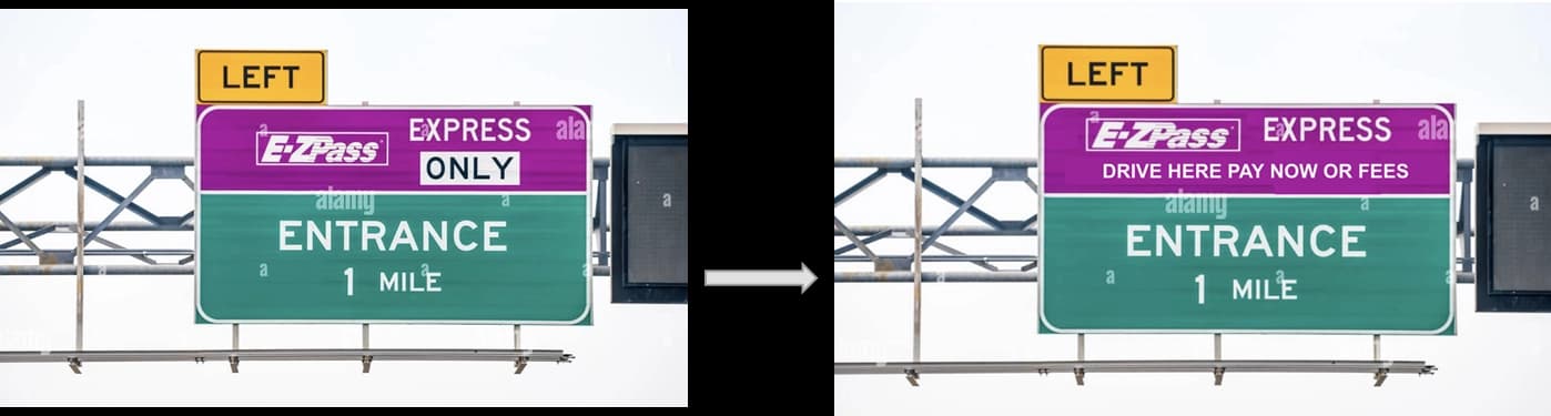
HOV entry signage caused consistent lane confusion
Participants consistently misidentified HOV entry points, particularly where Express and General Purpose lanes diverge. Signage cognitive load was compounded by high driving speeds, users reported not having sufficient time to parse multi-element sign compositions before passing the decision point.
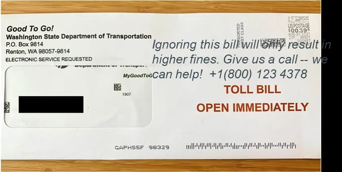
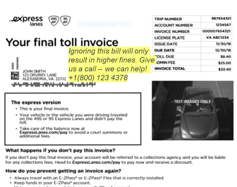
Finding 02, Penalty communication
Physical penalty letters generated avoidance, not compliance
The formal tone and visual density of penalty correspondence caused anxiety rather than motivating resolution. Several participants described leaving penalty letters unopened, a behavioral pattern with direct downstream consequences for Transurban's collections rate and user retention.
Finding 03, Account management
Cluttered interface obscured primary account actions
The existing account portal presented all functions at equal visual weight, transaction history, auto-replenishment settings, transponder management, and statements competed for attention on a single crowded screen. Participants required significantly more time-on-task than expected for routine actions like adding funds or checking a balance.
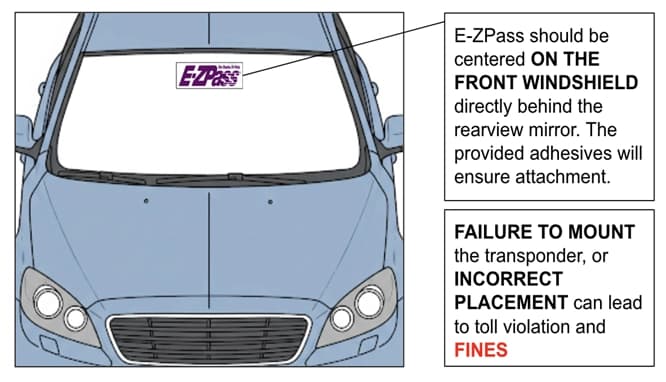
Finding 04, Transponder onboarding
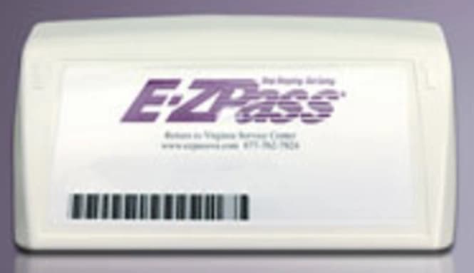
Physical installation instructions generated repeated errors
First-time users consistently misplaced transponders, attaching them below the windshield's metallic band or behind rearview mirror housing, leading to read failures at toll gantries. The included instruction sheet lacked clear spatial reference points, forcing users to rely on trial and error.
Cross-cutting insight
The most consistent underlying theme across all four domains: the system was designed from an operational perspective, not a user mental model perspective. Signage, penalty letters, account structure, and installation guides all reflected how Transurban categorizes information internally, not how a commuter navigating a highway at 65mph processes and acts on it.
Measuring usability with validated instruments.
To complement the qualitative findings, we administered two standardized usability measurement instruments: the System Usability Scale (SUS) and the User Experience Questionnaire (UEQ). Using validated scales allowed us to benchmark Transurban's performance against established norms and quantify the severity of identified issues with statistical grounding.
Participants completed both instruments immediately following their usability testing session, while task experience was still fresh, minimizing retrospective bias and ensuring ratings reflected actual interaction difficulty rather than general satisfaction.
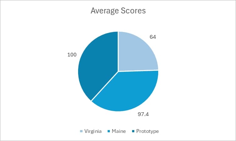
System Usability Scale (SUS)
10-item Likert-based usability benchmark
The SUS produces a 0–100 composite score where 68 is the industry average. Scores below 68 indicate usability below acceptable thresholds; scores above 80 indicate excellent usability. Our results provided a quantified severity index to prioritize recommendations.
User Experience Questionnaire (UEQ)
Multi-dimensional UX quality assessment
The UEQ evaluates six dimensions, Attractiveness, Perspicuity, Efficiency, Dependability, Stimulation, and Novelty - on a -3 to +3 scale. This allowed us to isolate which UX dimensions were underperforming relative to industry benchmarks, providing targeted design direction beyond a single composite score.
%20Results.png&w=3840&q=75&dpl=dpl_FAWV6AEQxbUyP2AeGmJckwTKJUWx)
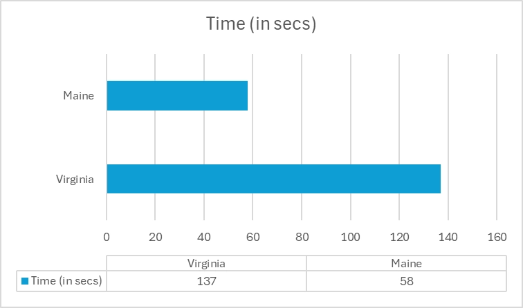
Task Completion Performance
Time-on-task analysis across key user journeys
Time-on-task was recorded for each usability testing scenario. Outlier times, where participants took significantly longer than expected or failed to complete a task, were cross-referenced with concurrent think-aloud narration to identify the specific interface element or content gap responsible for the delay.
What the existing system looked like.
A heuristic evaluation of the existing Transurban account portal was conducted in parallel with user research. Evaluating against Nielsen's 10 usability heuristics surfaced structural IA issues that user testing later confirmed through behavioral evidence, providing triangulated confidence in the findings.
Four research-backed design directions.
Each recommendation maps directly to a finding from the research synthesis. Priority was determined by the intersection of prevalence (how many participants experienced it), severity (how significantly it impacted task completion), and addressability within Transurban's product roadmap.
↳ HOV wayfinding confusion
Simplify signage through progressive disclosure
Replace multi-element sign compositions with a sequenced signage system, delivering one critical decision cue per sign in the approach sequence rather than all information simultaneously. Prioritize high-contrast color coding aligned with the existing E-ZPass branding system to reduce cognitive parsing time at highway speeds.
↳ Penalty letter avoidance behavior
Redesign penalty communication as plain-language guidance
Reframe penalty correspondence from formal legal notices to action-oriented user communications. Lead with the resolution path, a clear, single-step call to action, before any fee or timeline information. Reduce information density by separating penalty notification from payment instructions across two distinct touchpoints.
↳ Account management task failure
Restructure account portal information architecture
Apply a task-frequency-based IA hierarchy: surface account balance, add funds, and recent transactions at the top level. Relegate low-frequency administrative actions (statement downloads, transponder settings) to a secondary layer accessible via explicit navigation. This directly addresses the cognitive load identified in the SUS and UEQ Perspicuity scores.
↳ Transponder placement errors
Redesign transponder installation guide with spatial anchors
Replace the text-heavy installation guide with a visual-first instruction set using windshield silhouettes as spatial reference frames. Include explicit callouts for common failure zones (metallic bands, mirror housings). Consider a short-form video QR code as a supplementary channel for users who need dynamic guidance.
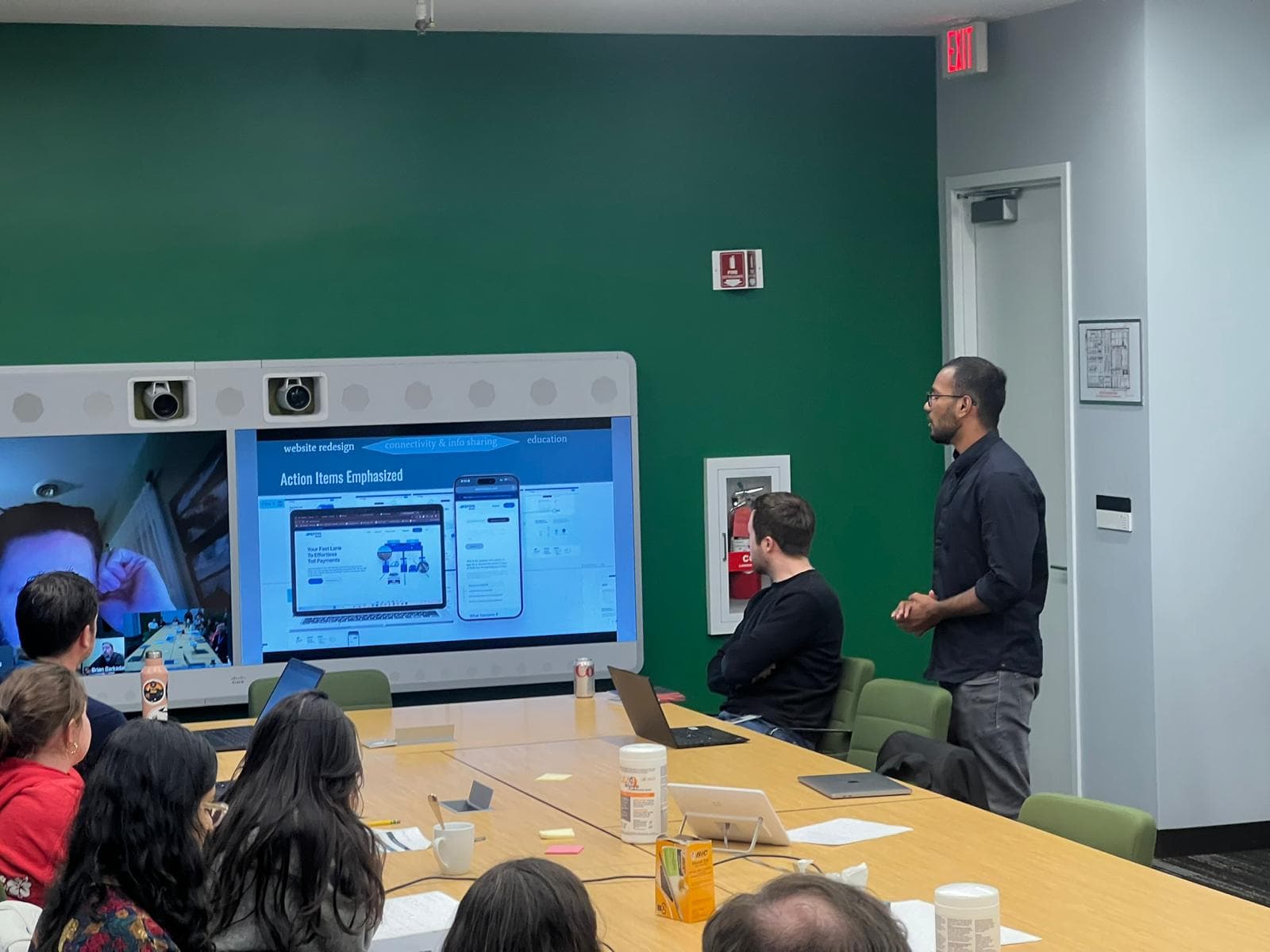
Research delivered in-house to Transurban.
The full research synthesis, covering survey analysis, interview themes, usability evaluation data, SUS/UEQ benchmarking, and prioritized recommendations, was presented in-person to the Transurban product and policy team in Virginia. The presentation was structured to map each finding to a business impact metric (collections rate, user retention, support ticket volume) to ground design recommendations in language relevant to the stakeholder audience.
What this project reinforced.
Reflection
Field research is irreplaceable
Being physically on-site in Virginia, with access to actual signage, penalty letters, and physical transponders, produced a qualitative depth that remote research could not have replicated. The materials themselves were data.
Reflection
Validated scales quantify what interviews describe
The SUS and UEQ gave us the numerical grounding to say 'this is below industry standard', not just 'users found this confusing.' Stakeholders responded to data-backed severity rankings in ways they wouldn't have to qualitative observations alone.
Reflection
Operational logic ≠ user mental model
Every usability failure we found traced back to the same root cause: the system was organized around how Transurban manages data, not how a commuter makes decisions. Naming this pattern early gave our recommendations a unifying rationale.
The Team
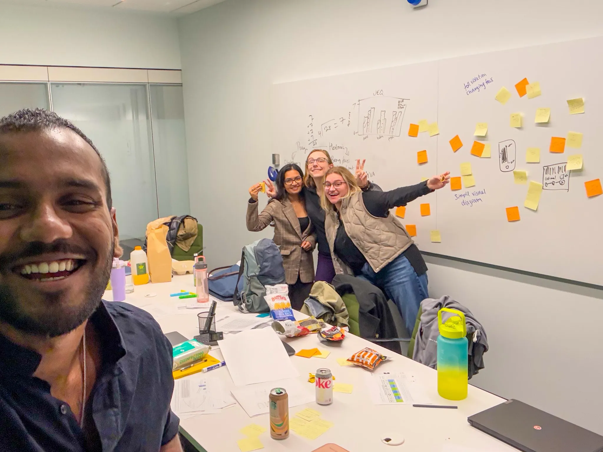
Usabilathon team, UX researchers competing in-house at Transurban's Virginia offices.