Redesigning the
Application Portal.
We condensed a 33-page monolithic form into a streamlined 4-step progressive flow , reducing navigation time by 80% for 750+ applicants annually.
Responsibilities
User research · UI/UX design · Agile sprint reviews · Prototyping · Component library · Usability testing · Developer handoff
Cross-functional Team
Project Managers · Tech Leads · Engineers · UI/UX Designers · Dev Reviewer (Microsoft Reston)
Tools
How we worked, Agile UX
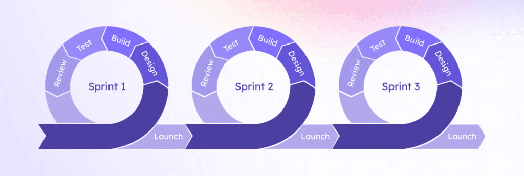
This project followed an Agile UX methodology, a hybrid of Lean UX thinking and Scrum sprint cadence. Rather than front-loading research before any design work, we ran parallel discovery and delivery tracks within each sprint.
Every Monday, the full cross-functional team convened for a structured sprint call: designers presented findings and prototypes, engineers flagged technical constraints, and the Microsoft Reston dev reviewer provided implementation-level feedback. Stakeholder interviews with Aaryan Patel (Recruitment Manager) were embedded into Sprint 1 and 2, ensuring the applicant-side redesign stayed aligned with recruiter-side backend requirements.
Agile UX Framework, Sprint Structure
- Stakeholder interviews
- Heuristic evaluation
- User flow mapping
- Pain point synthesis
- IA restructure
- Low-fi wireframes
- Flow validation
- Recruiter alignment
- High-fidelity UI
- Component library
- Prototype iteration
- Dev review (Microsoft)
- Accessibility audit
- Dev handoff docs
- Reviewer interface
- Production launch
Why Agile UX?, The project had hard sprint deadlines, an active engineering team writing code in parallel, and a dev reviewer who needed to sign off before each sprint closed. Waterfall wasn't an option. Agile UX let us validate with users early and course-correct without losing velocity.
We audited a 33-page barrier.
HackImpact UMD receives 750+ applications every year. The existing portal was a monolithic form spanning 33 sequential pages with zero progress indication , applicants had no visibility into how much of the form remained.
Our heuristic evaluation surfaced a critical visibility-of-system-status violation (Nielsen's Heuristic #1): users were making decisions about whether to continue without any affordance showing their position in the task flow. Drop-off was a predictable consequence.
Compounding this: a prominent Admin Login CTA on the primary login screen created a consistent points of confusion , applicants interpreted it as a required step, generating recurring support overhead for the HackImpact team.
We mapped both sides of the system.
Before touching a single frame in Figma, we conducted contextual inquiry sessions with current and former applicants, and ran a structured stakeholder interview with Aaryan Patel (Recruitment Manager) to capture the recruiter-side mental model and backend constraints.
We then synthesized findings into a dual-lane user journey map , one for applicants, one for reviewers , to identify where the two flows intersected, where they diverged, and where the current IA was forcing them to collide unnecessarily.
Applicant pain points
- ,No progress indication; cognitive load from unknown form length led to premature abandonment
- ,Fear of data loss: no auto-save affordance, no explicit session persistence cue
- ,Dual-login confusion: Admin Login CTA intercepted applicant intent on the primary auth screen
- ,Checkbox overload for skill selection: high cognitive cost, poor scannability
- ,Post-submission silence: zero status visibility after application submitted
Recruiter / reviewer pain points
- ,No access to partial or in-progress applications; blind spots in pipeline visibility
- ,Manual email-based status updates for every state change , no scalable notification system
- ,No centralized review dashboard; context-switching across multiple tools
- ,Inconsistent UI made dev iteration slow , no shared component language between design and engineering
Key research insight
The most critical finding: applicants and reviewers were sharing a single entry point without differentiated routing. First-time applicants needed to land on the form; returning applicants needed to land on their status page. The original IA treated them as identical , routing everyone to the same screen regardless of context, generating friction for both personas.
From constraints to high-fidelity.
We ran three rounds of design critique within each sprint , internal review, cross-functional team review (Monday sprint call), and Microsoft dev reviewer sign-off. This created a structured validation gate before any work moved to implementation.
The login screen alone went through six documented iterations , each addressing a specific piece of feedback from the Monday sprint call or a usability issue surfaced during prototype walkthroughs with applicants.
Design principle
One primary action per screen
Reduced the cognitive load of every screen to a single decision point. Eliminated competing CTAs (e.g., Apply vs Admin Login on the same surface).
Design principle
Progressive disclosure over front-loading
Broke the monolithic 33-page form into four logically sequenced steps. Users only saw what was relevant to their current task.
Design principle
Affordances that match user mental models
Replaced checkbox grids with pill-style multi-select , matching how users think about skill tagging rather than how a database schema thinks about it.
Six targeted design interventions.
Each design decision maps directly to a research finding. None were aesthetic choices , each solves a specific usability problem identified during discovery.
01
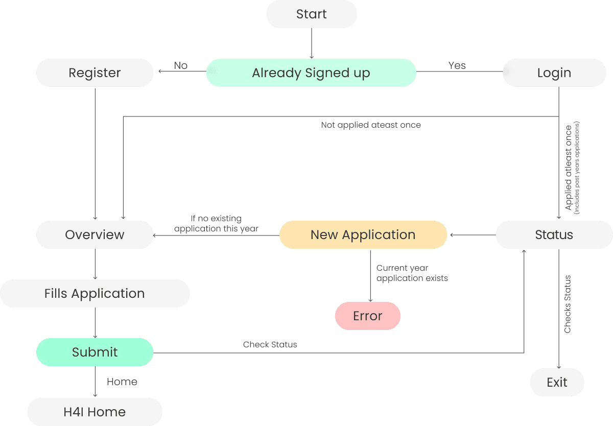
Restructured the information architecture.
Separated the applicant-facing form flow from the status-checking flow into two distinct, context-aware entry points. Returning applicants are now routed to their status page; first-time applicants land directly on Step 1 of the form. Single-application-per-cycle enforcement was built in at the routing layer , if a user attempts to reapply within an active cycle, they receive a clear, non-blocking error state rather than reaching a confusing mid-form dead end.
Before vs After , Entry point routing
Before
All users → single login screen → same landing page regardless of context (first-time vs returning)
After
First-time → Step 1 of application form · Returning → Status page · Duplicate attempt → Error state with clear messaging
02
Eliminated the competing auth entry point.
The Admin Login button was removed from the primary auth screen and relocated to a separate, non-indexed route. This resolved the dual-intent confusion identified in research , applicants no longer encountered an action irrelevant to their task on the screen they visit first. Password reset and account creation options were repositioned below the fold, reducing visual noise at the primary decision point.

03
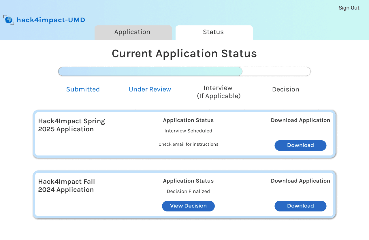
Introduced a transparent application status tracker.
Research surfaced a recurring pattern: applicants emailing the HackImpact team asking "did you receive my application?" The root cause was zero post-submission feedback. We introduced a status page with a three-stage progress timeline (Submitted → In Review → Decision), categorized into Active and Inactive states. Actionable affordances , Download Application and View Decision , were added as contextual actions that appear only when relevant to the current application state.
04
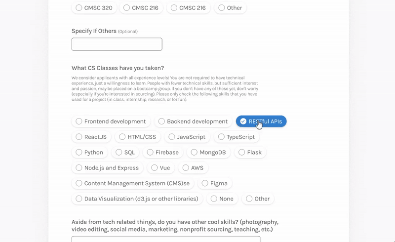
Replaced checkbox grids with pill-style multi-select.
The original skill selection interface used a dense checkbox grid , high cognitive load, poor visual hierarchy, no grouping. We replaced it with pill-style multi-select components: scannable, tap-friendly, visually organized by skill category. The selection interaction changed from a mechanical checkbox-tick pattern to something closer to how users naturally think about tagging , which drove measurable increases in form completion time.
Interaction rationale: Checkboxes communicate "select from a list of options." Pills communicate "this is your set of attributes , build it." The semantic framing shift alone reduced hesitation during usability walkthroughs.
05
Built a standardized component library for scale.
The original portal had no shared design language , each screen was styled independently, creating visual inconsistency and making engineering iteration slow and error-prone. We authored a modular component library in Figma covering: standardized form inputs and labels, submission and navigation buttons, pill-select components, typography scale and spacing tokens, and status state variants. The Microsoft dev reviewer specifically called out the component library as the element that made dev handoff viable.
06
Introduced a 4-step progressive form with explicit wayfinding.
The 33-page form was restructured into four logically sequenced steps, each scoped to a single thematic cluster of questions. A persistent step indicator at the top of every form screen provides explicit wayfinding , users always know their position in the task flow, how many steps remain, and can navigate backward without data loss. This directly addresses the primary abandonment driver identified in research.
Shipped. Live. Measurable.
The redesigned portal is night and day compared to what we had. Our applicants are actually completing the form now instead of dropping off. The component library made our engineering iteration dramatically faster.
What this project reinforced.
Reflection
IA before UI
Restructuring the user flow before opening Figma saved two full sprint cycles. Premature visual design on a broken architecture would have been expensive to undo.
Reflection
Embedded dev review accelerates quality
Having a Microsoft engineer in every Monday sprint call meant implementation constraints surfaced in the design phase , not during handoff. Edge cases were caught before they became bugs.
Reflection
Design systems are leverage
When the dev reviewer requested changes across eight screens in Sprint 3, we updated one component and it propagated everywhere. The component library paid for the time it took to build it within two weeks.
The Team
Cross-functional team: Project Managers · Tech Leads · Engineers · UI/UX Designers · Microsoft Reston Dev Reviewer
What comes next.
Reviewer-side interface
Design and prototype the recruiter dashboard , the second half of the dual-user system.
Accessibility audit
WCAG 2.2 conformance testing, screen reader validation, and keyboard navigation coverage.
Developer handoff documentation
Full spec sheets, interaction annotations, and component usage guidelines for engineering.